Manager Menu
To open the Manager dashboards menu select Manager from the main menu.
- The Manager dashboards menu opens.
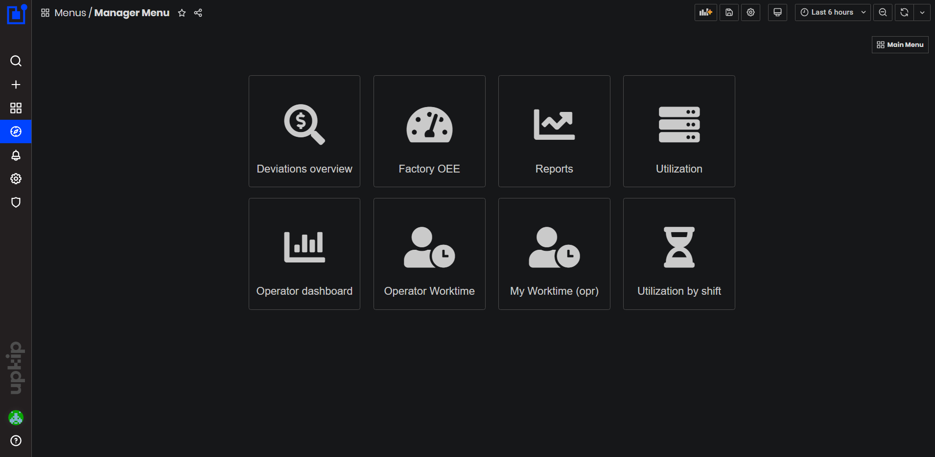
Figure 1: Manager dashboards
Deviation Overview
Precondition: To open the Deviations Overview dashboard select:
- Main Menu/Manager/Deviations Overview
- The Deviations overview dashboard opens.
Purpose: Dashboard shows charts and graphics for different deviations related to orders, alarms, and machines OEE.
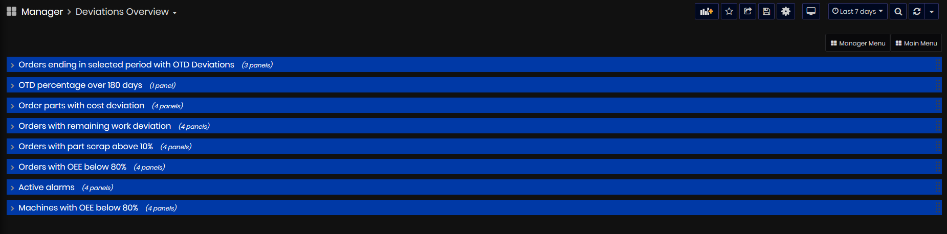
Figure 2: Deviation overview dashboard
- Orders ending in selected period with OTD Deviations
- OTD percentage over 180 days
- Order parts with cost deviations
- Order parts with negative cost deviations
- Orders with remaining work deviation
- Orders with part scrap above 10%
- Orders with OEE below 80%
- Active alarms
- Machines with OEE below 80%
Orders ending in selected period with OTD Deviations
The OTD deviations panel presents information about orders with OTD deviations and planned stop date in the selected time period.
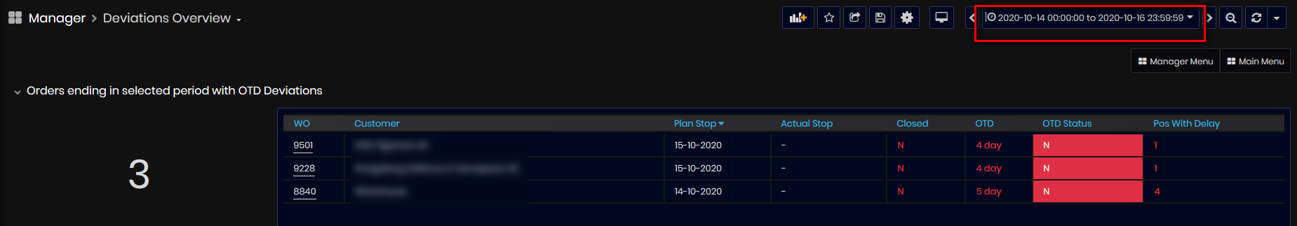
Figure 3: Deviation overview - Orders ending in selected period with OTD deviations
The number of work orders is calculated as amount of work orders with negative OTD deviation and work orders with parts with negative OTD.
The percentage is calculated as (Orders with OTD = N) / (Orders planned to end in the period, including orders without deviations).
The table shows the list of work orders with the Plan Stop date in the selected time period and some deviations (positive or negative) in the following columns: Work order number, Customer, Plan Start, Plan Stop, Actual Stop date, Closed (Y or N), OTD (as number of days), OTD Status (Y/N), and Parts With Delay(number of parts/positions with delay).
The OTD status cell colored red means that the production of the order has been delayed.
The OTD Status cell colored green means the order is delivered before the planned end date.
The OTD column shows the number of days/weeks the order has been delayed.
For details on OTD calculations, go to Work orders OTD calculation
OTD percentage over 180 days
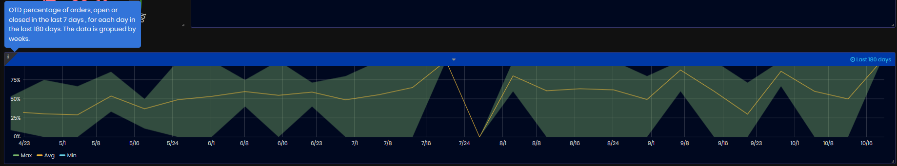
Figure 4: Deviation overview - OTD percentage over 180 days
The chart shows minimum, maximum and average OTD percentage of work orders opened or closed during the week, grouped by weeks for the last 180 days.
Order parts with cost deviations
The panel presents information on parts of the orders with positive cost deviation for the selected time period.
The Cost deviation is calculated as a deviation in hours multiplied by the cost per hour.
For details on calculation, go to Parts Cost Deviations.
The number shows the number of parts with positive cost deviation at the last day from the selected time period.
The upper chart shows the number of parts with positive cost deviation over time. The values are per day.
The second chart shows cost deviations by days and last values (NOK) for different orders with parts with cost deviations for the selected time period. The values are per day.
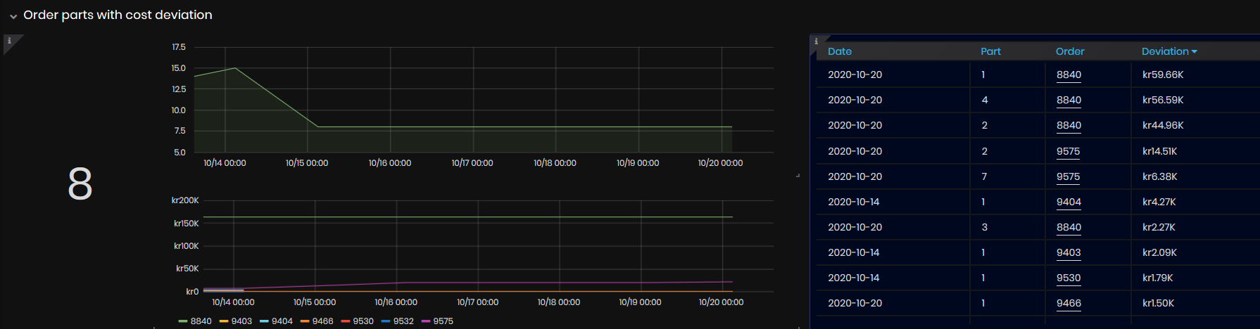
Figure 5: Deviation overview - Order parts with cost deviation
The table to the right of the charts shows the latest values of positive cost deviations for various parts and orders for the selected time period: Date, Order (number), Part (number), and Deviation (NOK).
Order parts with negative cost deviations
The panel presents information on parts of the orders with negatibve cost deviation for the selected time period.
The Cost deviation is calculated as a deviation in hours multiplied by NOK per hour.
For details on calculation, go to Parts Cost Deviations
The number shows the number of parts with negative cost deviation at the last day from the selected time period.
The upper chart also shows the number of parts with negative cost deviation for the selected time period. The values are per day.
The second chart shows cost deviations by days and last values (NOK) for different orders with parts with cost deviations for the selected time period. The values are per day.
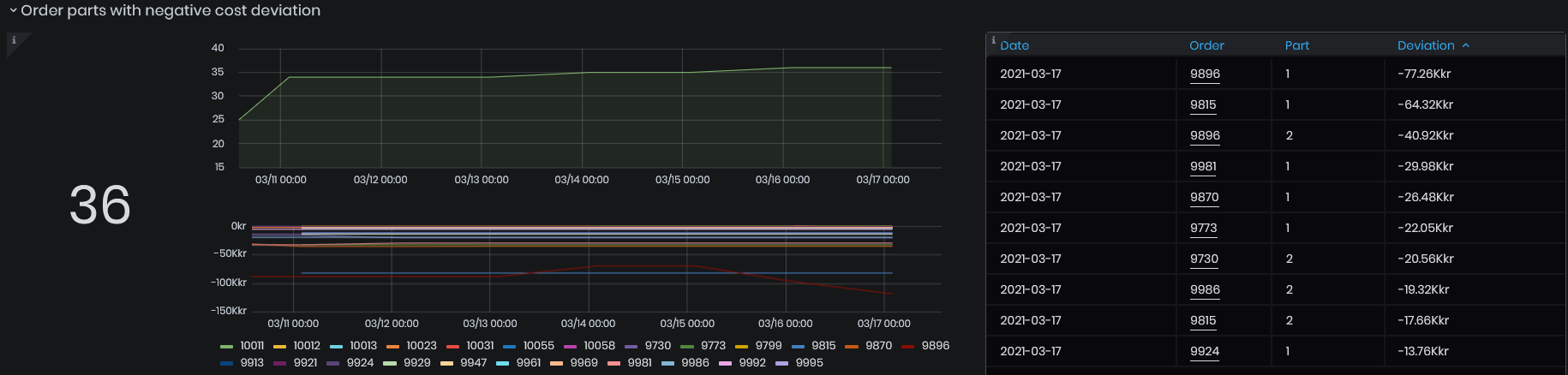
Figure 6: Deviation overview - Order parts with negative cost deviation
The table to the right of the charts shows the latest values of negative cost deviations for various parts and orders for the selected time period: Date, Order (number), Part (number), and Deviation (NOK).
Orders with remaining work deviation
The panel presents information on orders with actual remaining work greater than the estimated remaining work.
For details on calculation, go to Order Actual remaining work.
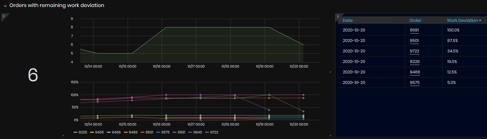
Figure 7: Deviation overview - Orders with remaining work deviation
The number shows the number of orders with more remaining work than estimated for the last day of the selected time period.
The upper chart shows the number of orders with positive work deviation by days for the selected time period.
The second chart shows the percentage of work deviations (difference between actual and estimated remaining work) of orders by days for the selected time period.
The table to the right of the charts shows the latest values for the selected time period :date, order, and percentage of work deviation.
The remaining work deviation(difference between actual and estimated remaining work) equal to 100% means that the order's due date has passed, but nothing is being produced yet. The Remaining work deviation is calculated when the order stop date is expires.
Orders with part scrap above 10%
The panel presents information on orders with part scrap above 10% for the selected time period.
For details on calculation, go to Calculation of parts scrap percentage.
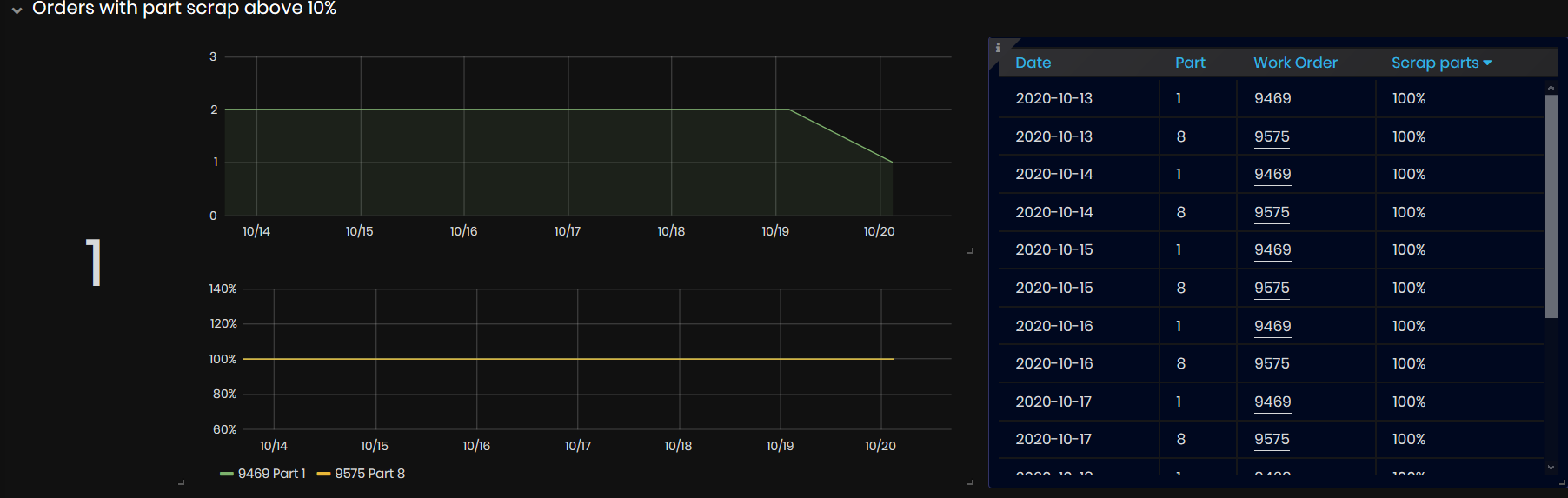
Figure 8: Deviation overview - Orders with part scrap above 10%
The number shows the number of orders with part scrap above 10%. The number is for the last day of the selected period.
The upper chart shows the number of orders with part scrap above 10%. The values are per day.
The bottom chart shows the percentage of part scrap for orders greater than 10%. The values are per day.
The table to the right of the charts shows the latest values for the selected time period: date, part number, work order and scrap parts percentage.
Orders with OEE below 80%
The panel presents information on work orders with OEE below 80% for the selected time period.
For details on calculation, go to Work orders OEE definition and calculation.
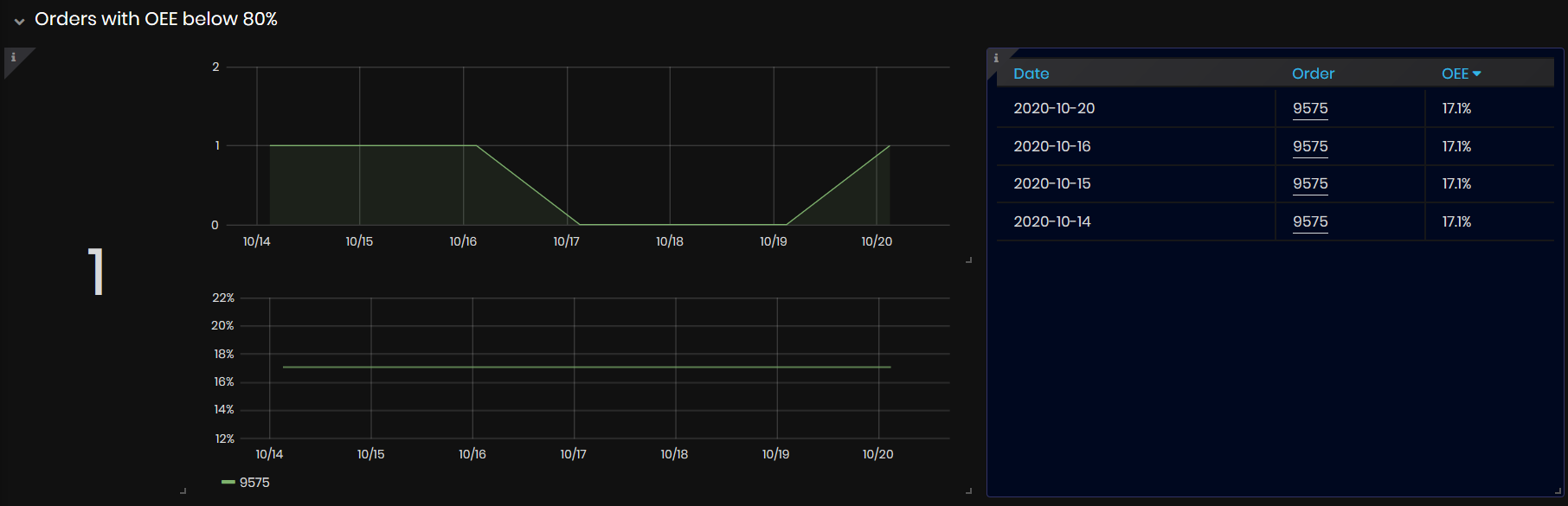
Figure 9: Deviation overview - Orders with OEE below 80%
The number shows the number of work orders with OEE below 80% at the last day from the selected time period.
The upper chart shows the number of work orders with OEE below 80% by days for the selected time interval. The values are per day.
The bottom chart shows work orders OEE percentages for the selected time period. The values are per day.
The table to the right of the charts shows latest values for the selected time period: date, order numbers and OEE percentage of the orders which are below 80%.
Active alarms
The panel presents the information on the number and list of currently active alarms.
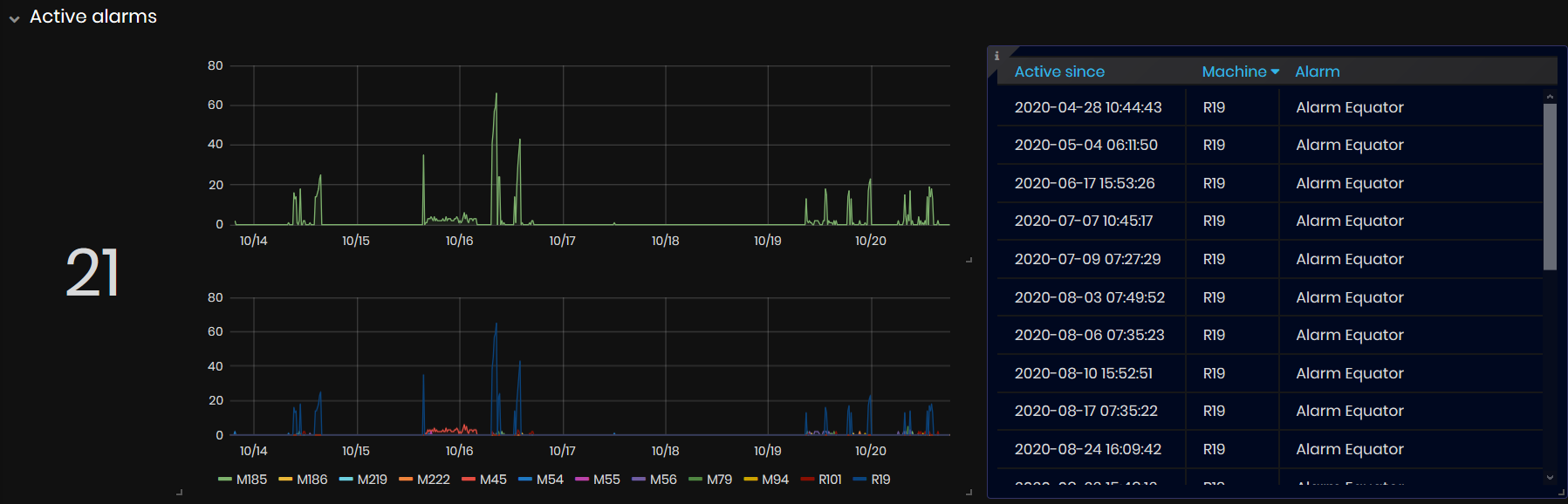
Figure 10: Deviation overview -Active alarms
The number shows the number of current active alarms from all machines in the factory.
The upper chart shows the number of active alarms per day during the selected time period.
The bottom chart shows the number of alarms by machines and days during the selected time period.
The table to the right of the charts shows the list of t currently active alarms by: Active since, Machine, Alarm.
For details, go to Alarms dashboard.
Machines with OEE below 80%
The panel presents information on machines with OEE below 80% for the selected time period.
For details on calculation, go to Machine OEE definition and calculation.
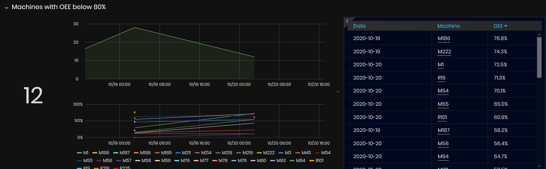
Figure 11: Deviation overview - Machines with OEE below 80%
The number shows the number of machines with OEE below 80% on the last day from the selected time period.
The upper chart shows the number of machines with OEE below 80% per day for the selected time period. The values are per day.
The bottom chart shows for each machine OEE% per days for the selected time period. The values are per day.
The table to the right of the charts shows the latest values for the selected time period: date, machine number and OEE percentage of the machines with OEE below 80%.
Factory OEE
Precondition: To open the Factory OEE dashboard select:
- Manager/Factory OEE
- The Factory OEE dashboard opens.
Purpose: The Factory OEE dashboard shows the average machines OEE for the selected time period. Machine OEE is calculated hourly.
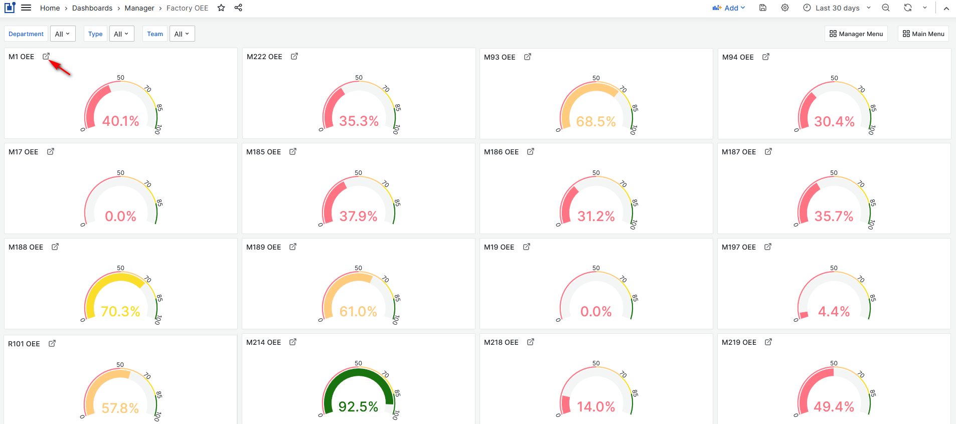
Figure 12: Factory OEE dashboard
From the Factory OEE dashboard, users can:
- View each machine OEE for the selected time period.
- Filter machines and check OEE by department or machine type or team.
- For each machine you can easily open dashboard with machine OEE details.
Filter machines in the Factory OEE is possible though:
- Department
- Machine Type
- Team
Through the upper left link is possible to open the detailed Machine OEE dashboard.
Reports
Precondition: To open The Reports dashboard select:
- Manager/Reports
- The Reports dashboard is opened
Purpose: Three types of reports are available. Data for the reports are imported from the EPR SAP Business 1.
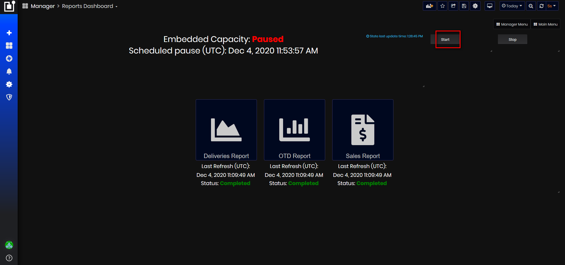
Figure 13: Reports dashboard - paused reports
Preparing reports:
After opening the page, if service is Paused, click the Start button. The information starts updating every 5 seconds.
There is scheduled time (UTC) for pausing the service if you don't click the Stop button.
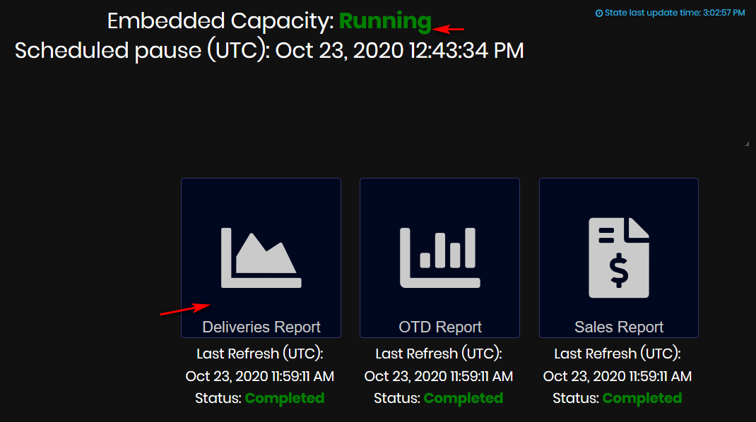
Figure 14: Reports dashboard - running reports
To open some report, both must be met:
-
Embedded Capacity : Running
-
Reports status: Completed
Then click to open any report.
Deliveries Report
Click the Deliveries Report button:
- The Deliveries according to plan report opens.
Using the Deliveries Report user can obtain information for the selected time period:
- The number of operations delayed from the plan by dates.
- The number of operations delayed from the plan by departments and dates.
- Pie chart with delayed operations and percentage by department.
- The chart with operations by dates - delayed oprerations by departments and dates.
Deliveries Report 1st page
This page of the report shows deliveries by departments for the selected time period.
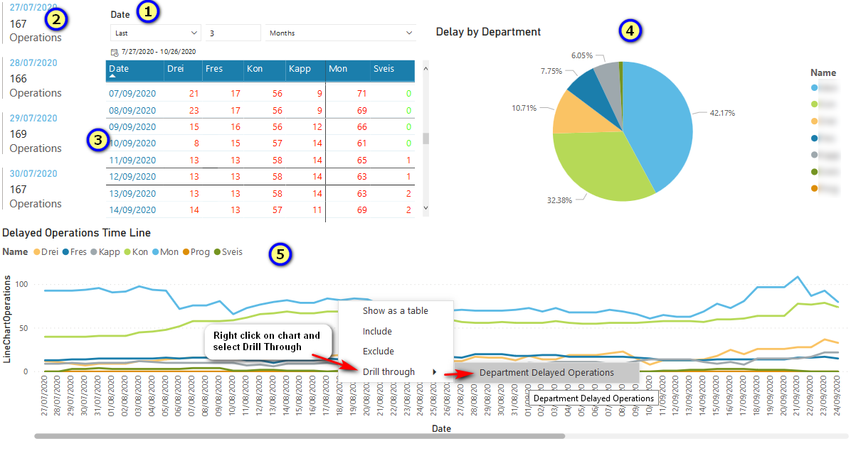
Figure 15: Reports dashboard - Deliveries report - 1st page
By default data are loaded for the last 7 days (1). The period is possible to filter by:
- Last, Next, This,
- Enter the number,
- Days, Weeks, Weeks (Calendar), Months, Months (Calendar), Years, Years(Calendar).
The column at the left shows by dates, the aggregated number of operations with delays for all departments.
The table with dates for the selected time period by departments. For each date and department is shown the number of delayed operations.
Pie chart Delay by Department shows the number of delayed operations and percentge by department. It is possible to filter by department.
Delayed operations time line.
For each department is presented line chart delayed operations per dates. It is possible to filter by department.
From Delayed operations time line by right-clicking on the line for department appears menu Drill through. Clicking on the menu appears menu Department Delayed Operations. Select the menu.
- The second page of the report is opened
Deliveries Report 2nd page
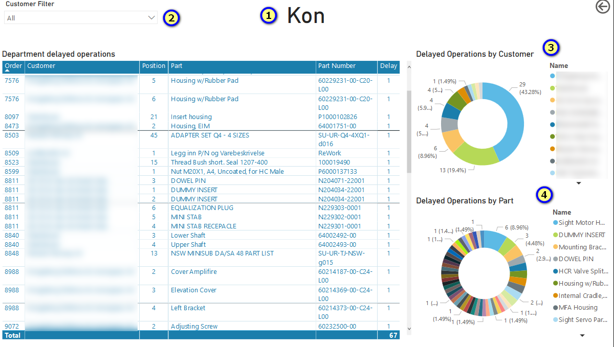
Figure 16: Reports dashboard - Deliveries report - 2nd page
This page display delayed operations for the department selected from page 1.
-
There is a filter by customer(s) and can filter the table.
-
For the selected customer(s) or All are listed in the table Department delayed operations:
- Order number, Customer, Position, Part name, Part number,Delay(number of delayed operations).
-
At the top right for the selected customer(s)or All is displayed doughnut chart Delayed operations by Customer.
-
At the bottom right for the selected customer(s) or All is displayed doughnut chart Delayed Operation by Part.
OTD Report
Click on the OTD Report button:
- The OTD Report opens.
Using an OTD report, the user can get the information for the selected time period:
- The percentage of Work Orders by Customers.
- Total OTD percentage - orders delivered on time to the total number of orders with a planned stop date in the selected period.
- The number of Work order delivered on time.
- The table of work orders and customers with planned stop in the selected time period with their OTD delays (positive or negative).
- When selecting a customer and a work order, it is possible to view details about the order positions(parts) OTD delays, total order OTD percentage.
OTD Report 1st page
This page of the report shows the work orders by customers and their OTD days and the total number of orders delivered on time for the selected time period.
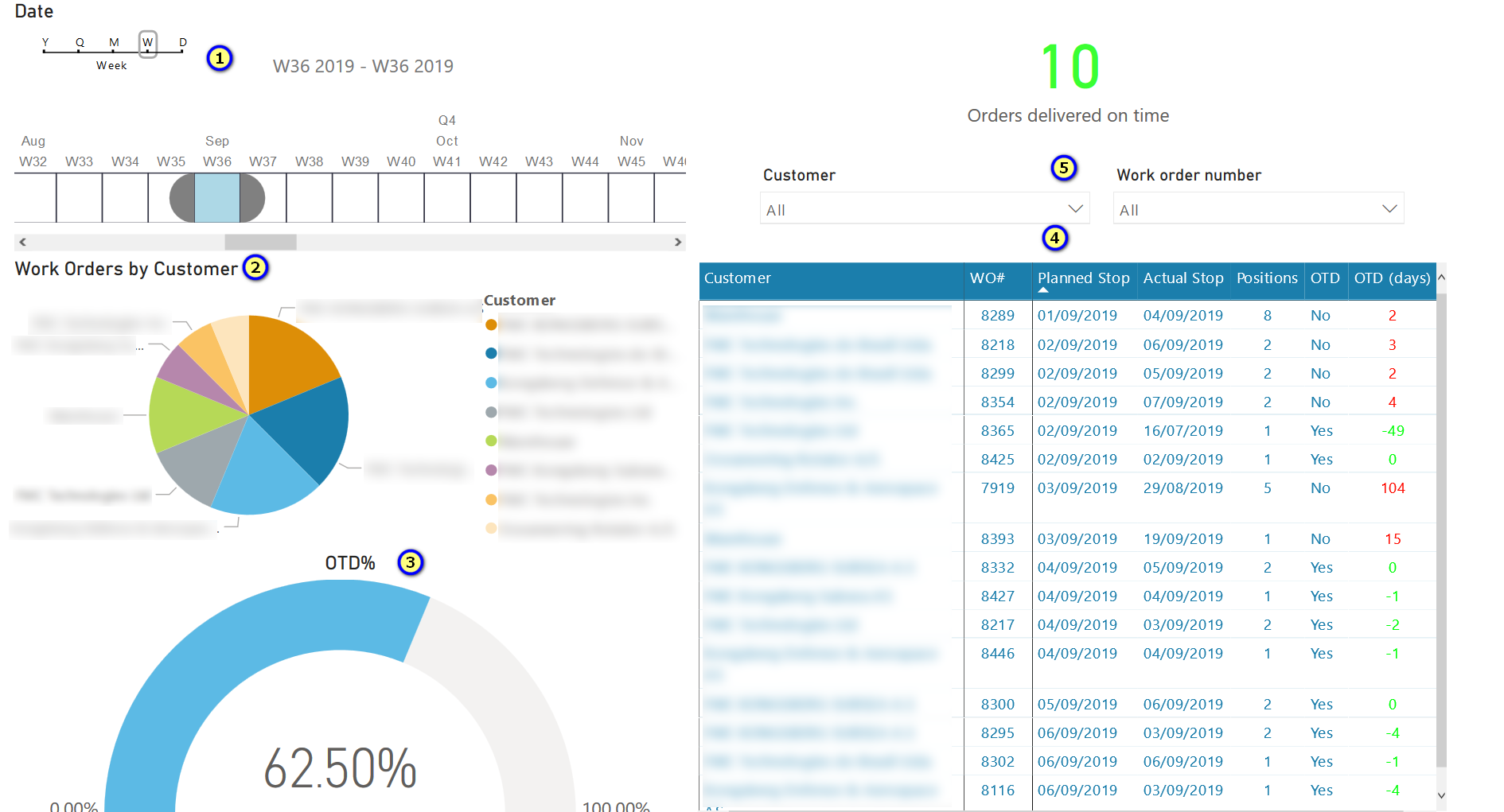
Figure 17: Reports dashboard - OTD report - 1st page
On the left side:
- There is a filter for the time period by selecting year, quarter, month, week, or day (1).
- For the selected time period is shown а pie chart Work Orders by Customer (2). For each customer is shown the number of orders and percentage of work orders.
- The pie chart OTD percentage (3) shows the on time delivered orders to all orders for the selected time period.
On the right side:
- Total number of orders delivered on time (green number) (5)
- Table with information for orders (4): customer, work order number, order planned stop, order actual stop, positions(number of positions in order), OTD (Yes/No), and OTD (days).
- On time delivered order colored in green are with OTD (days) negative number or zero. It shows how many days before planned stop has finished the order.
- The orders with actual stop date after the planned stop date have OTD (days) positive numbers colored in red.
- There are filters (multiple select) by customer(s) and work order(s) for filtering the table.
Right clicking on the table appears menu Drill through menu. Click the menu opens Workorder OTD menu. Select the menu Workorder OTD.
- The page 2 of the report for the selected work order and customer opens.
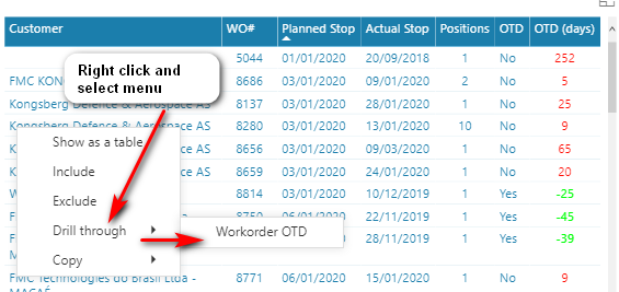
Figure 18: Reports dashboard - OTD report - 1st page-drill through selected work order
OTD Report 2nd page
This page of OTD reports shows OTD information for all parts (positions) from the order. Customer name and work order number are listed on the top.
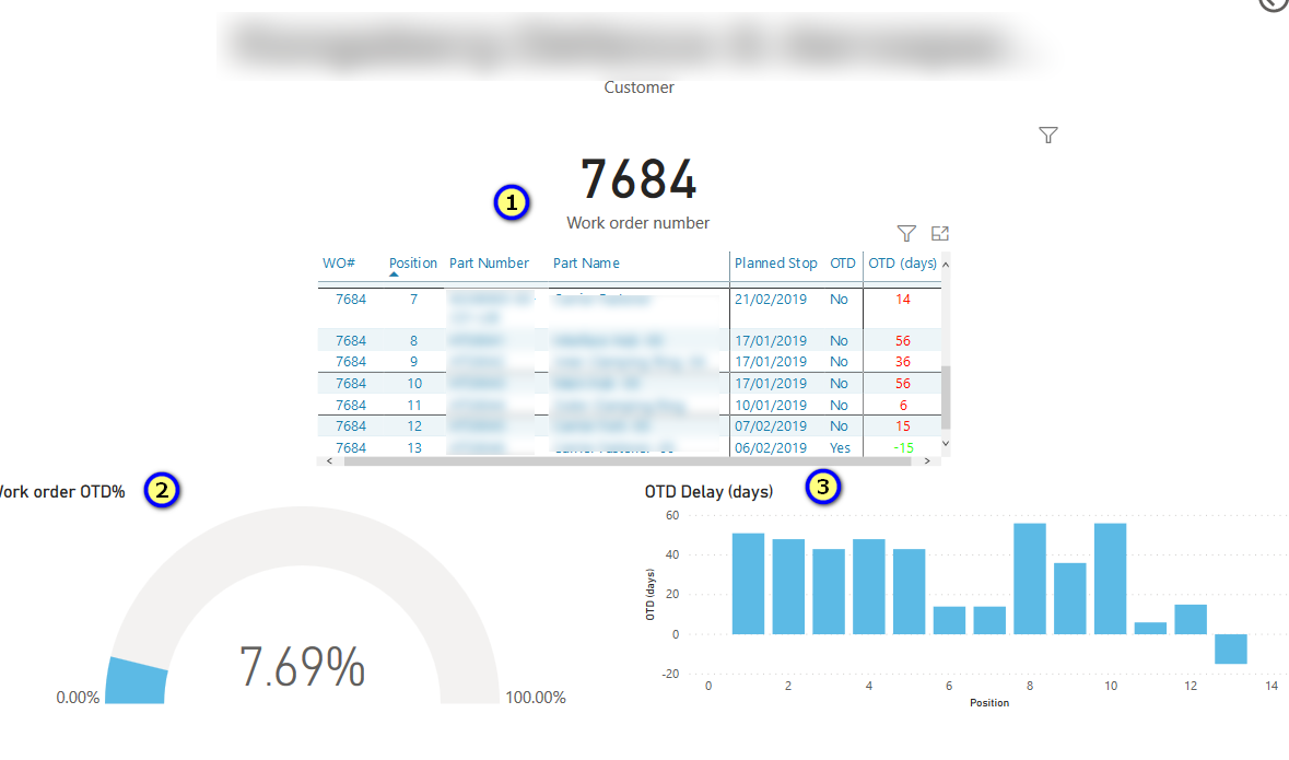
Figure 19: Reports dashboard - OTD report - 2nd page
- In the table are listed on different rows for each position (part) of the order: WO(work order number), Position(number), part number, part name, part planned stop, part OTD (Yes or No), part OTD (days). The OTD(days) in red means delays in days for the part, negative number or zero in green means on time delivery before planned stop date for the part.
- The pie chart Work order OTD shows Work order OTD percentage by parts = on time delivered parts to all parts.
- The bar chart per position and OTD delays (days) for each position(part)
Sales Report
Click the Sales Report button:
- The Sales Report opens.
Using the Sales Report users can get the information for the selected time period:
- Top 5 grossing customers and top 10 grossing parts.
- Percentage of Sales vs Budget
- Turnover value per customer; Tur.nover chart by dates.
- New registered sales per customer.
- Decomposition of a total price by years.
Sales Report 1st page
This page of the report shows for the selected time period:
- Top 5 grossing customers.
- Top 10 grossing parts.
- Percentage of sales vs budget.
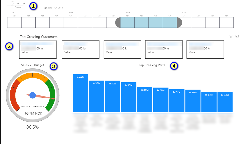
Figure 20: Reports dashboard - Sales report - 1st page
- The Time period can be selected by Y (Years), Q(quarter), M(month) and W(week) and selecting in the slider and corresponding numbers.
- Top Grossing Customer – on the top are listed 5 top-grossing customers by their names and sales (NOK kr)
- Gauge shows percentage Sales vs Planned budget for the selected period. The budget value is taken from the Upkip Administration/Budget. configuration for the corresponding year and months.
- Top 10 grossing parts – bar chart for 10 grossing parts (part name and part number) and sales (NOK kr)
Report 2nd page
This page of the report shows for the selected period:
- Filter for changing the time period (1)
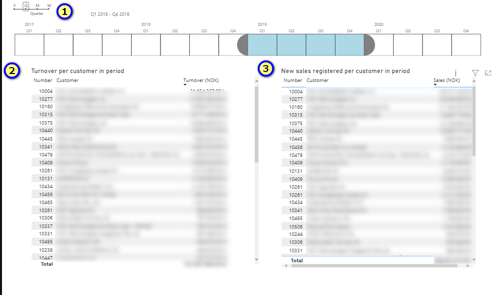
Figure 21: Reports dashboard - Sales report - 2nd page
- Left table shows Turnover per customer in period: Number, customer, Turnover (NOK)
- The right table shows New sales registered per customer in period: Number, customer, Turnover (NOK)
At the bottom of both tables are calculated the total of turnover or sales (NOK)
Report 3rd page
This page of the report shows a line chart for Turnover per Date, for the selected time period.
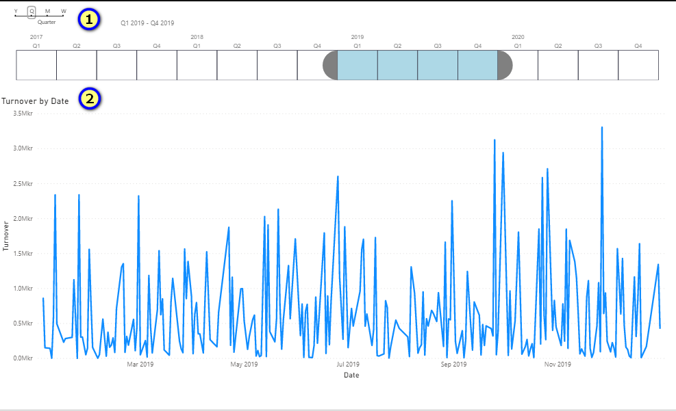
Figure 22: Reports dashboard - Sales report - 3rd page
Report 4th page
This page of the report is used for decomposition of Total Sales by years. Clicking on the plus sign could be selected – Customer, Quarter, Month, Day,Part Name, Part Number, Invoice Number, Part Name, and Number. When Customer has selected, then it can decompose by selected items. etc.
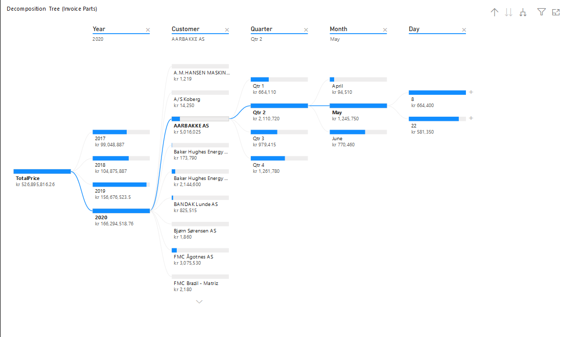
Figure 23: Reports dashboard - Sales report - 4th page
Operator Dashboard
To open the Operator dashboard select:
- Manager/Operator Dashboard
- The Operator Dashboard opens.
Purpose: The Operator Dashboard presents information on logged operator time per day, downtime per operator, and productivity coefficients. There is information for each operator and aggregated information about selected operators.
Data for the operators are imported from the SAP Business 1 system into ConfigDB by adapter (sapb1) monitors for changes on each minute. Data are manipulated and presented by graphics and charts.
From Operator dashboard users with role Manager can see for the selected time period:
-
For the selected operator:
- Total logged time in hours.
- Time per machine and downtime.
- Logged time per day.
- Coefficient Logged time (hours)/shift hours.
-
For all selected operators aggregated information:
- Total logged time.
- Total logged time per day.
- Productivity coefficients for the last 180 days (chart), aggregated by weeks as min, max, and average graphic.
- Total coefficient calculated as sum of logged hours divided by logged hours.
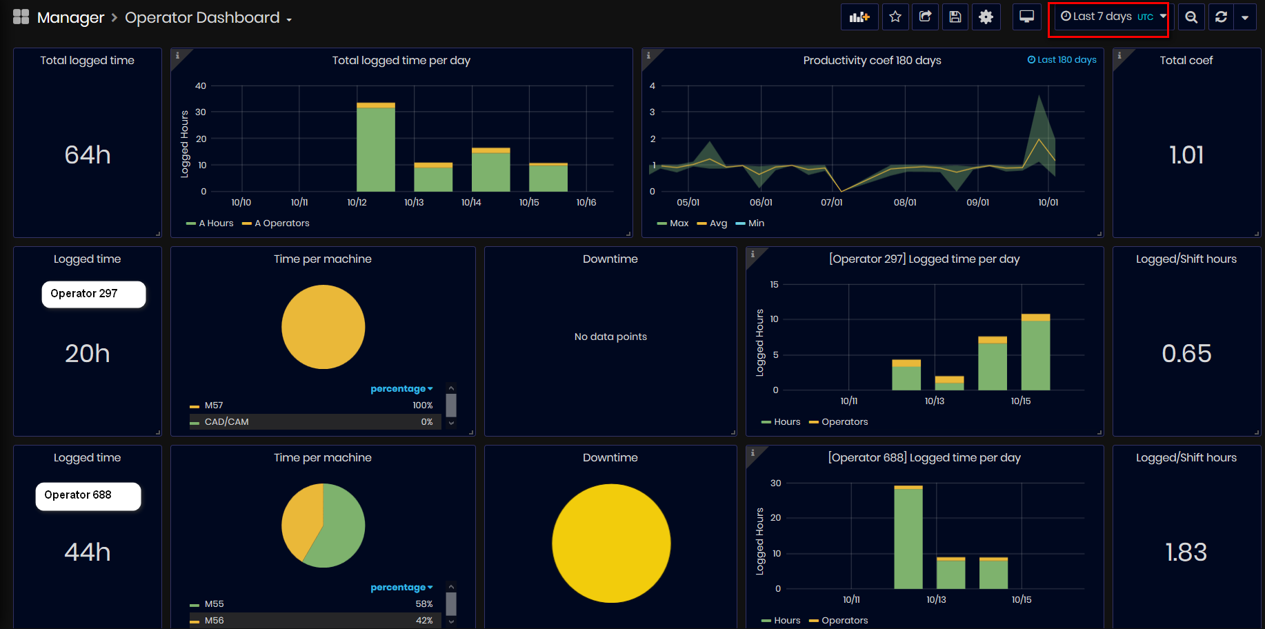
Figure 24: Operator dashboard
It is possible to select an operator or many operators from the drop-down list.

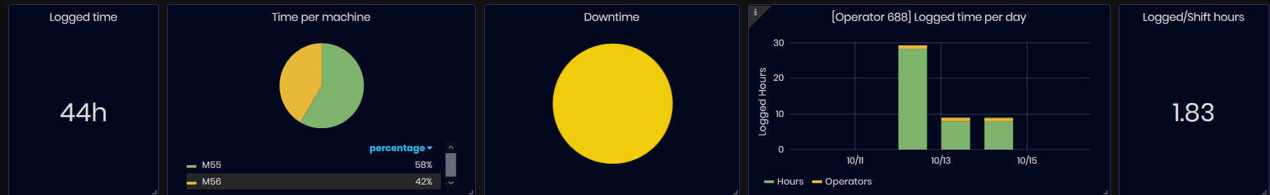
Figure 25: Operator dashboard - Operator panels
-
Total logged time for operator for the selected time period as value in hours.
-
Pie chart with time per machine in duration (hours/weeks) and percentage of the all logged time.
-
Downtime pie chart.
-
Operator logged time per day (chart).
-
Coefficient Logged hours/shift hours.
At the top of the dashboard, there is a panel with aggregated information for all selected operators for the selected time period.
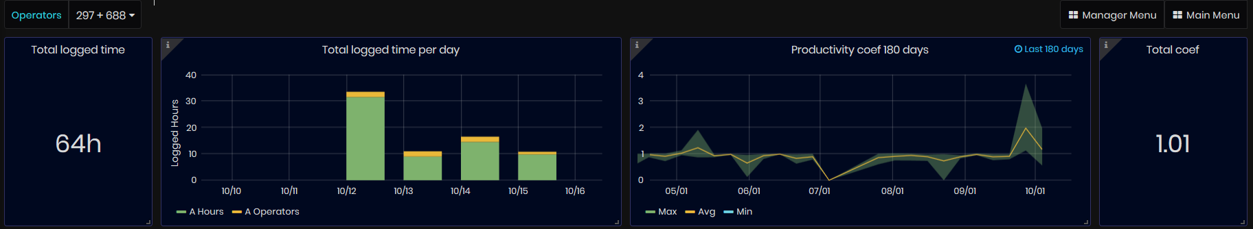
Figure 26: Operator dashboard - Aggregated information
-
Total logged time as a sum of all logged times (in hours) of all operators for the selected time period.
-
Total logged time per day for all days during the selected time period are shown by bars number of operators and sum of logged hours per day.
-
Productivity coefficients for the last 180 days sum of total logged hours divided by total shift hours for the selected operators, grouped by weeks. There are presented graphics with min, max, and average values for each aggregated point for the week.
-
Total productivity coefficient calculated as total logged hours for the selected operators divided by total shift hours.
At the bottom is presented a pie chart Downtime per operator.
The chart shows for all operators for the selected time period percentage of downtime time (only Untagged is included, OK and Unplanned are excluded).
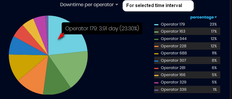
Figure 27: Operator dashboard - Downtime per operator
Mouse over the pie chart shows: operator number and duration of time.
Operator Worktime
To open the Operator Worktime dashboard select:
- Manager/Operator Worktime
- The Operator Worktime dashboard opens.
Purpose: The Operator Worktime dashboard is accessible only by users with role Manager. The dashboard presents information about selected operator for the selected time period including some production parameters and KPIs: logged time in hours, logged time per day, productivity coefficients, average order OEE, time per machine, work orders with OTD.
Data for the operators are imported from SAP Business 1 system into Configuration database by adapter (sapb1) that monitors for changes on each minute. Data are manipulated and presented in user-friendly way.
From Operator Worktime Dashboard users with role Manager can see for the selected operator and time period:
- Total logged time (in hours).
- Productivity coefficient calculated as Logged hours divided by shift hours.
- Average Order OEE (in %).
- Time per machine (in duration and percent for each machine used in the selected interval).
- List of work orders produced during the period with information for OTD and Closed/Active.
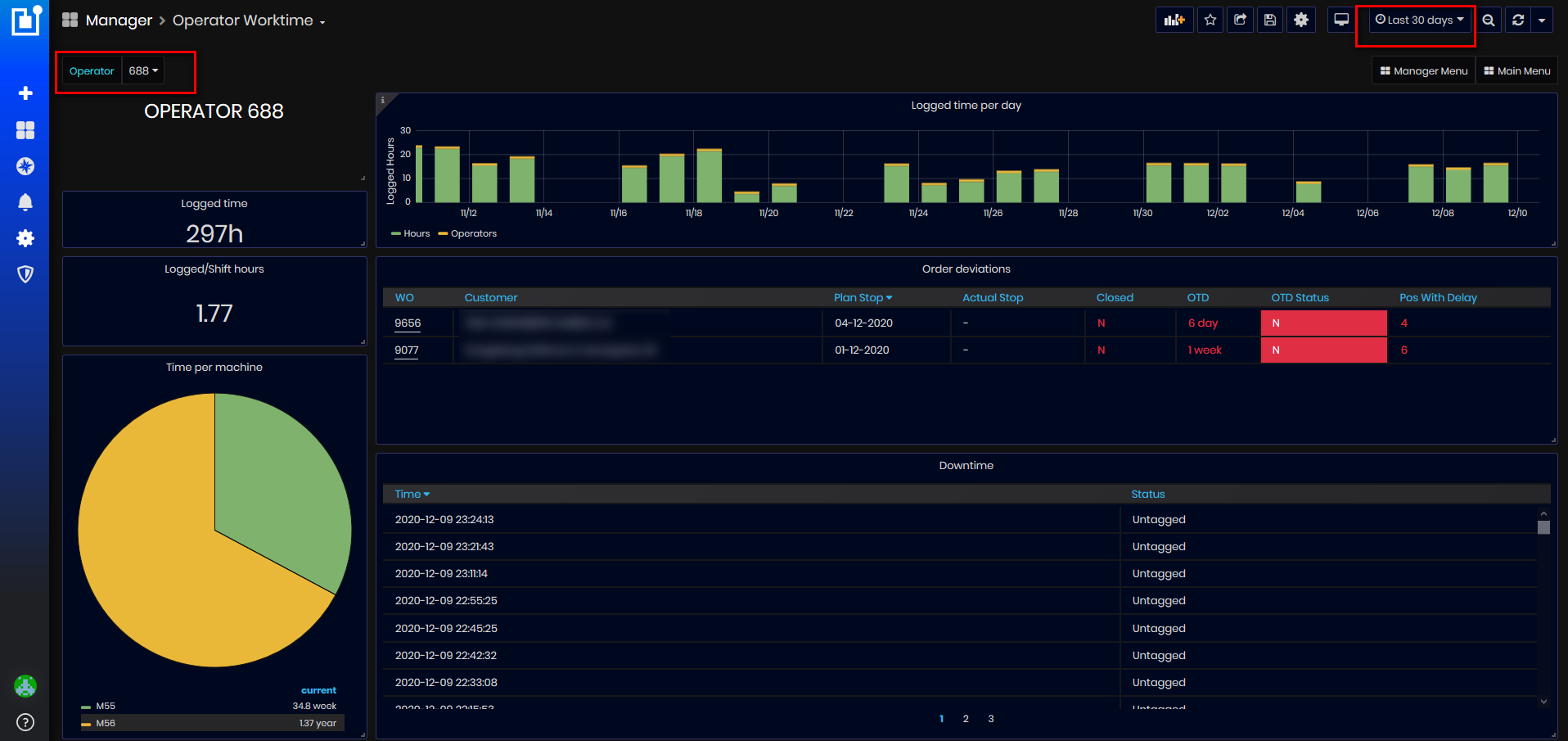
Figure 28: Operator Worktime dashboard
Selecting the operator is possible from the drop-down list with numbers of all operators.
- The dashboard is loaded with information for the selected operator and the selected time period.
All operator parameters are calculated for the selected time period.
- Logged time – summary of logged time.
- Logged time / shift hours – Logged operator time divided by shift hours.
- Time per machine – for each machine on which has worked operator is presented as a duration of time and percentage of all logged time of the operator.
- Logged time per day (hours per day) – of operator for the selected time period.
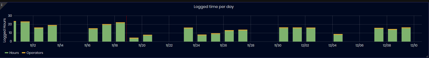
Figure 29: Operator Worktime dashboard - Logged time per day for operator
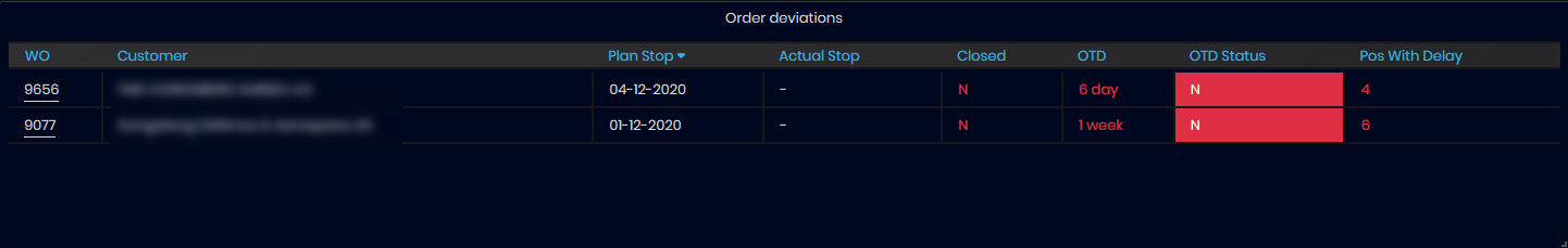
Figure 30: Operator Worktime dashboard - Order deviations for operator and selected time period
- Order Deviations – a table with Work Orders list for operator. For each
work order are presented information:
- Work Order Number – Clicking on the link with WO number is opened Work Order dashboard with detailed information for work order
- Customer Name - Customer name
- Plan Stop (date) and Actual Stop (date-time) – dates of the work order
- Closed – Y or N (if a work order is closed or not)
- OTD (On Time Delivery). With green or red colors are shown if the order has finished on time or before the planned stop date or has some days delay(red color).
- Pos with Delay – Number of parts(pos) which has delay
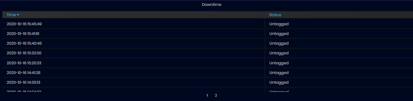
Figure 31: Operator Worktime dashboard - table with downtime untagged series data
- Downtime – table with information from InfluxDB with time-series data for Downtime Untagged status excluding statuses OK and Unplanned.
Utilization
To open the Utilization dashboard select:
- As a user with role Manager: Main Menu/Manager/Utilization.
- As a user with role Supervisor: Main Menu/Supervisor/Utilization.
- The Utilization dashboard opens.
Utilization is a percentage of time a machine is reporting an active state (counted statuses Active and Producing).
Downtime is a percentage of time a machine is down, reciprocal to utilization. Machine operators is possible to select a downtime reason that could be analyzed.
From the Utilization dashboard users can see:
- The number of hours machines have been producing during a specific work hour and day.
- The number of hours the machines have been producing during a weekday and month.
- The number of downtime events that occurred per department.
- Utilization chart with the number of hours machines worked per day by departments.
- Utilization chart with the number of hours machines worked for the last week.
Using this dashboard supervisors or managers can make analyses about production in the factory. A utilization rate that consistently approaches 100% indicates that you’re overworking your staff, and it may be time to expand. A utilization rate that is consistently low means there isn’t enough work in the pipeline, too many hours are being wasted on non-billable administrative functions, or it might indicate that your company has too many freelancers on projects. Utilization rates that are consistently too high or too low aren’t good for your organization and typically indicate future risks.
When opening the Utilization dashboard and default time interval is “This week so far”
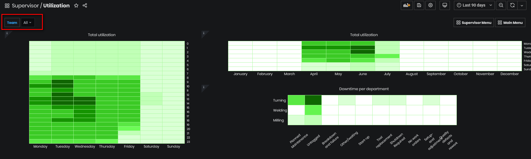
Figure 32: Utilization dashboard
The first heat map, Total Utilization (by day hours and weekdays) presents the number of hours the machines have been producing (counted Active and Production state) during the hours from the day (0-23) and days (Mon-Sun) of the week.
The darkest color block shows the biggest number of machine active hours. The lightest color block shows the lowest number of the machine hours. The user can look at hourly and weekly data simultaneously and make analyses.
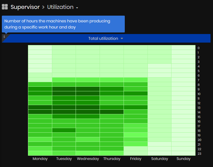
Figure 33: Utilization dashboard - Utilization by hours of day and days of week
The second heat map chart, Total Utilization (by days of week and months of
the year)
presents the number of hours the machines have been producing during the days of
week and months of the year.
For example: when time interval is Last 1 year, with the darkest color (biggest number of machines hours) are Wednesday from May.
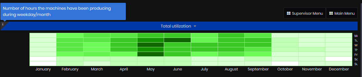
Figure 34: Utilization dashboard - Utilization by days of week and months of year
The 3rd heat map chart presents the number of downtime events per department. For Departments Turning, Milling and Welding user can analyze for which type downtime (related to Man, Machine, Method of work or Materials) there are more events and to do some related actions about production organization.
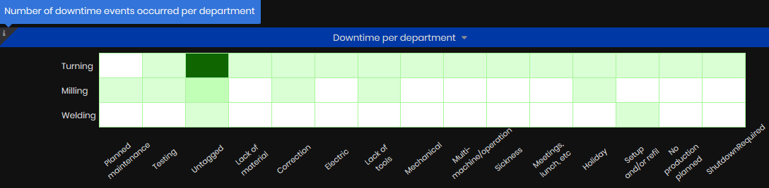
Figure 35: Utilization dashboard - Downtime events per department
Heatmap charts can be filtered by Team(s), selected from the teams list.
The next Utilization chart presents aggregated hours of active machines per day during the selected time interval (counted statuses Active and Producing).
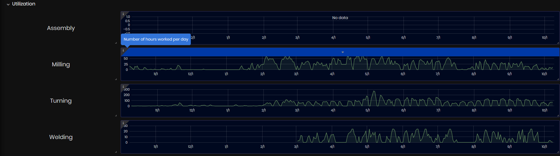
Figure 36: Utilization dashboard - Aggregated hours of active machines per day
The Utilization (week) shows the number of active machines working at the same time per hour.
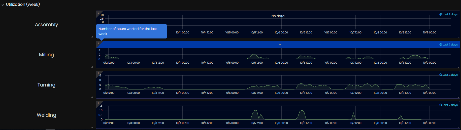
Figure 37: Utilization dashboard - number of active machines working at the same time per hour
Utilization by Shift
To open the Utilization by shift dashboard select:
- Manager/Utilization by shift
- The Utilization by shift dashboard opens.
Purpose: The Utilization by shift dashboard shows machine utilization during the shifts for the selected time period (by default the last 7 days).
Machine utilization is a useful time of machine (e.g status Active or Producing) for the period.
For the selected time period user with role Manager can see:
- Machine Utilization as a duration of time and percentage for Shift1 or Shift2 (Shifts are assigned to the machine in Upkip Administration Calendars).
- Machine timeline chart with statuses, duration and percentage of each status during the shifts.
- Machine pie chart with duration, and percentage of Active statuses vs all other statuses.
- Summary aggregation pie charts of Utilization vs other statuses during the shifts for the selected team(s).
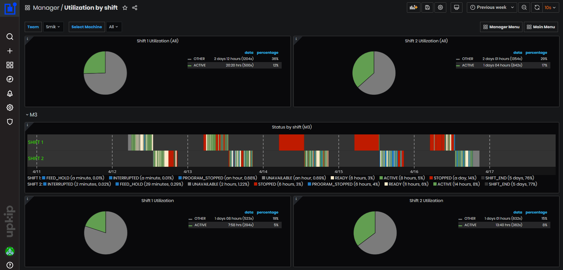
Figure 38: Utilization by shift dashboard
Filtering is possible by a team or by machine
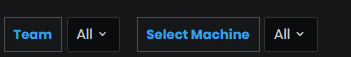
Figure 39: Filtering by team and machine
For each machine, information is shown in expandable panels.
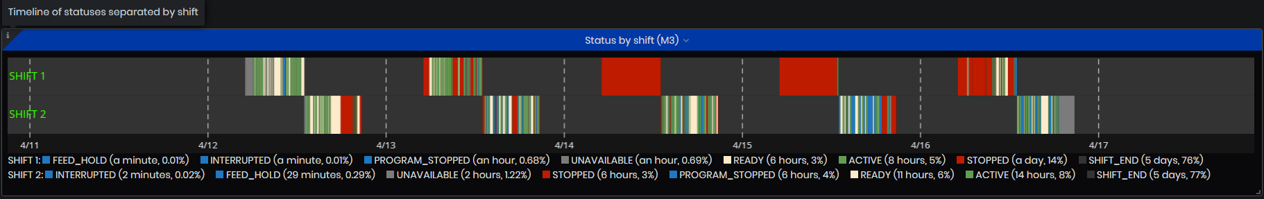
Figure 40: Timeline chart of machine statuses separated by shifts
For the selected time period for each machine are shown:
- Timeline chart with machine statuses for Shift1 and Shift2 (assigned to machine)
- For each status has a legend with name, duration, and percentage
- Pie chart of Utilization vs all other machine statuses as a duration of time and percentage
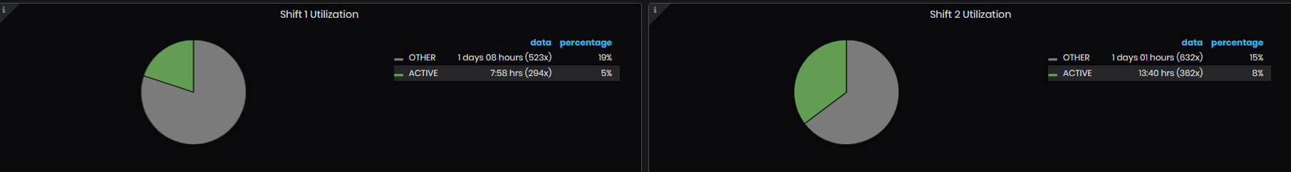
Figure 41: Machine pie chart utilization
At the top are shown an aggregation pie chart of all filtered machines Utilization vs all other statuses.
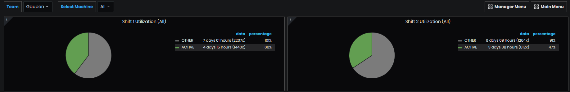
Figure 42: Aggregated Utilization by shifts and teams