System Menu
The System menu button is only visible to users with System Administrator role.
Click the System menu button from the main menu.
- The System dashboards menu opens.
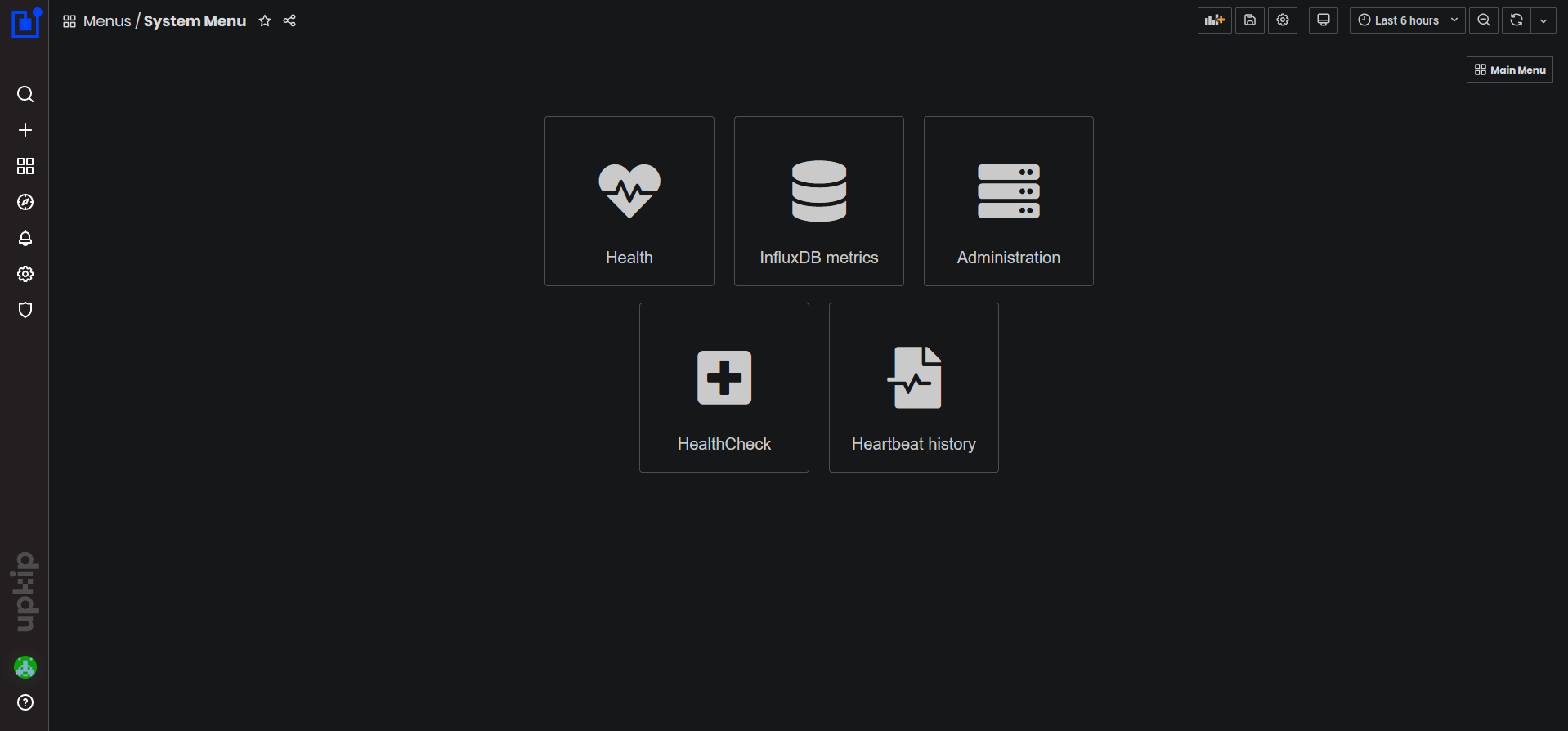
Figure 1: System dashboards menu
System Health
Click the System/Health menu button.
- The System Health dashboard opens. The System Health dashboard is typically viewed for the last 24 hours period.
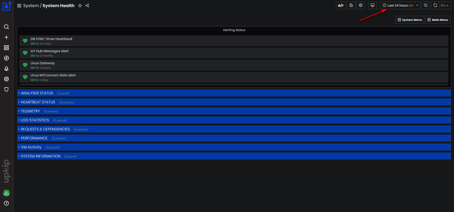
Figure 2: System Health dashboard
The System Health dashboard has the following sections:
- Alerting status
- Analyzer status
- Heartbeat status
- Telemetry
- Log statistics
- Requests & Dependencies
- Performance
- VM activity
- System information
Alerting Status
At the top of the dashboard is shown Alerting Status
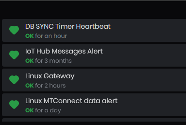
Figure 3: System Health dashboard - Alerting status
This is a list of all heartbeat alerts and their current status configured based on the heartbeat charts above. All instruments described above are also configured to show the alerting status.
Alerting status can be one of the following:
- Green – OK – this means that heartbeat signals are coming regularly with no delay and no loss.
- Orange – Pending – this means that heartbeat signals are not currently incoming but an alert is not yet sent. The system is in a “waiting-for-the-heartbeat-to-be-restored” state.
- Red – Alerting – this means that heartbeat signals have not been received for an unreasonable amount of time and are not expected to restore by themselves. This means that a problem has occurred in the corresponding gateway which needs to be mitigated.
On the heartbeat tables the status is binary:
- Green – OK – this means that heartbeat signals are currently coming.
- Black – Not OK – this means that heartbeat signals are not currently coming.
ANALYSER STATUS
Expand the panel ANALYSER STATUS
- The instrument Execution table is shown
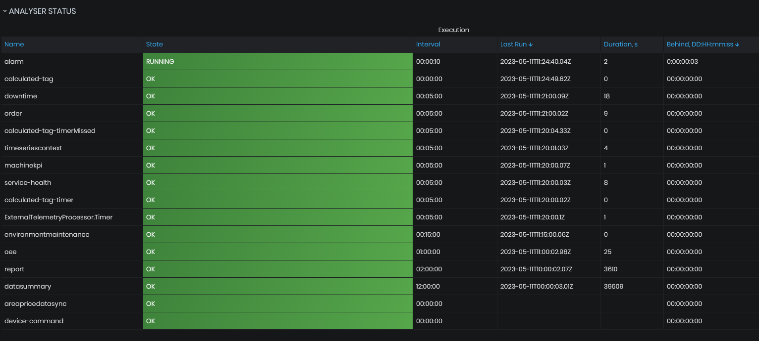
Figure 4: System Health dashboard - Analyser status
The execution table shows a list of all analyzers currently running in the system and their status calculated according to their last execution time. Each analyzer is responsible for a specific group of tasks and runs asynchronously on a configured time interval.
-
Name – this is the name of the analyzer, which points to the scope of its tasks
-
State – this is a human-readable text describing the closest state of the analyzer which is evaluated based on the Behind value. The state could be one of the following:
- Green – OK – no delay, the analyzer is running fine
- Blue – Running – the analyzer is being delayed for some small amount of time which is normal due to the fact that it processes a huge amount of data with many algorithms
- Red – Overdue – the analyzer is being delayed for a long time which usually means that there is some problem that needs to be mitigated
-
Interval – this is the interval shown in the form of {hours:minutes: seconds}
-
Last Run – this is the timestamp in UTC of the time when the analyzer was last triggered by the Azure runtime. This time points to the start of its work and is only updated when the analyzer finishes its work successfully
-
Behind – this shows a delay – the amount of time the analyzer is behind its next scheduled run. The value is presented in the form of {days hours:minutes: seconds} which is calculated on the basis of Last Run and Interval. If the analyzer fails to run successfully, it is expected that this value will start raising
HEARTBEAT STATUS
Expand the panel HEARTBEAT STATUS
- The heartbeat status graphics and cardiograms are shown.
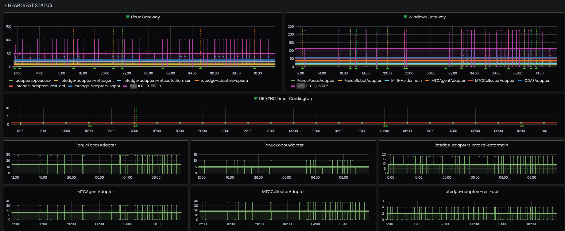
Figure 5: System Health dashboard -Heartbeat status graphics
Linux and Windows Gateways
The list of the graphics include:
- Linux Gateways
- Windows Gateways
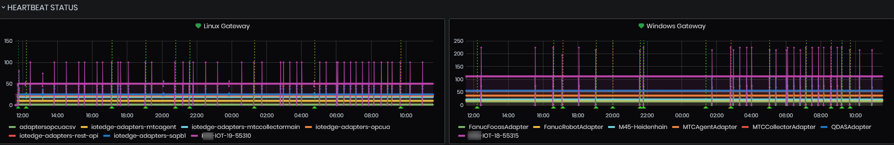
Figure 6: System Health - Heartbeat status - Gateway status
The time period is selected - Last 1 hour (UTC).
DB SYNC Timer

Figure 7: System Health - Heartbeat status - DB SYNC timer
This is an asynchronous timer-based function in Azure that accomplishes data synchronization and other similar tasks. It also sends heartbeats to the back-end services for the purpose of checking whether everything in the cloud works fine without being dependent on the gateways in the client premises.
Linux and Windows adapters
-
Linux adapters
- Linux iotedge-adapters-mtcagent
- Linux iotedge-adapters-mtccollectormain
- Linux iotedge-adapters-opcua
- Linux iotedge-adapters-opcua-csv
- Linux iotedge-adapters-rest-api
- Linux iotedge-adapters-sapb1
-
Windows adapters
- Windows Fanuc Ficas adapter
- Windows Fanuc Robot adapter
- Windows Heidenhain adapter
- Windows MTC Agent adapter
- Windows MTC Collector adapter
- Windows OPCUA module
- windows QDAS adapter
For each gateway and gateway module, there is a dedicated chart showing the history of the number of heartbeats sent by it.
The time period is defined by the selected dashboard period.
The number of heartbeats sent at each interval corresponds to the number of machines dependent on this module or in the case of a gateway this number is always 1 (the gateway itself).
Based on these charts are configured system notifications that automatically notify of a heartbeat loss.
TELEMETRY
Expand the panel TELEMETRY
- The telemetry graphics are shown
Archiving Progress
The panel shows the progress of the telemetry archiving process. It runs daily and archives the telemetry database to a dedicated archive DB then deletes all archived data from the telemetry DB to free up space.
 Figure 8: System Health - Telemetry - Archiving progress
PowerBI Embedded Capacity ON
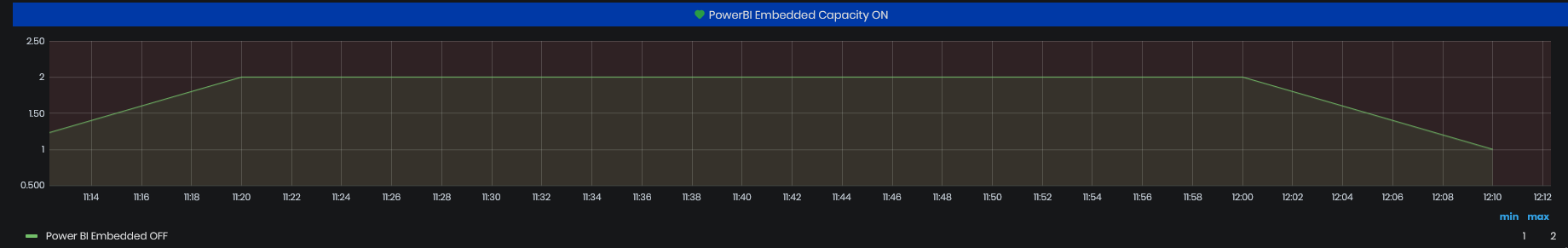
Figure 9: System Health - Telemetry - PowerBI Embedded Capacity
The PowerBI is used in reports generation. If PowerBI Embedded Capacity is turned ON for a long time the alert is generated. If the capacity is not turned OFF soon, there are expected high costs.
IoT Hub Data Usage(1 Minute)
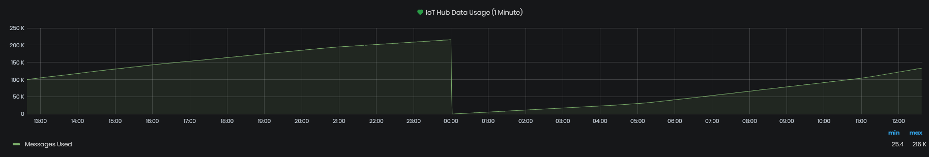
Figure 10: System Health - Telemetry - IoT Hub data usage (1min)
This chart shows:
- Messages used - the number of messages used from the IoT Hub’s daily messages quota. This is reset each day at 00:00 UTC.
- Device data usage - the amount of data sent to the IoT Hub from devices
IoT Hub Telemetry(1 Minute)
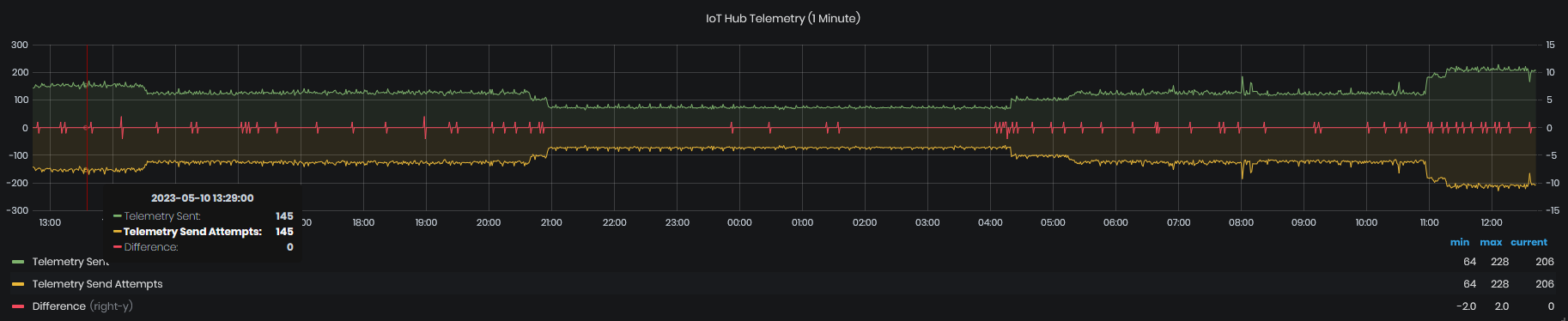
Figure 11: System Health - Telemetry - IoT Hub telemetry (1min)
The chart shows telemetry sent to IoT Hub, telemetry send attempts and difference.
External Sensors Calculated Tags Counts
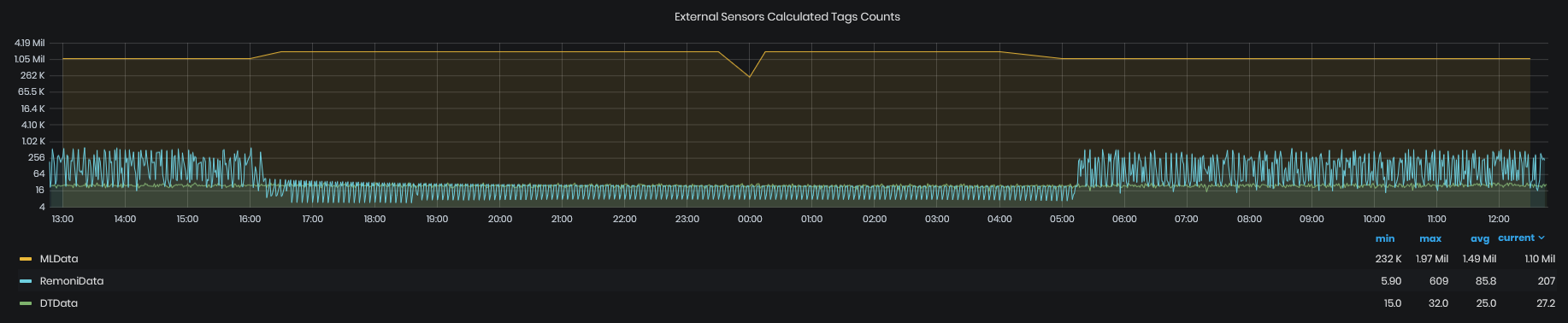
Figure 12: System Health - Telemetry - External sensors calculated tags counts
Events Ingested per Gateway(stacked)
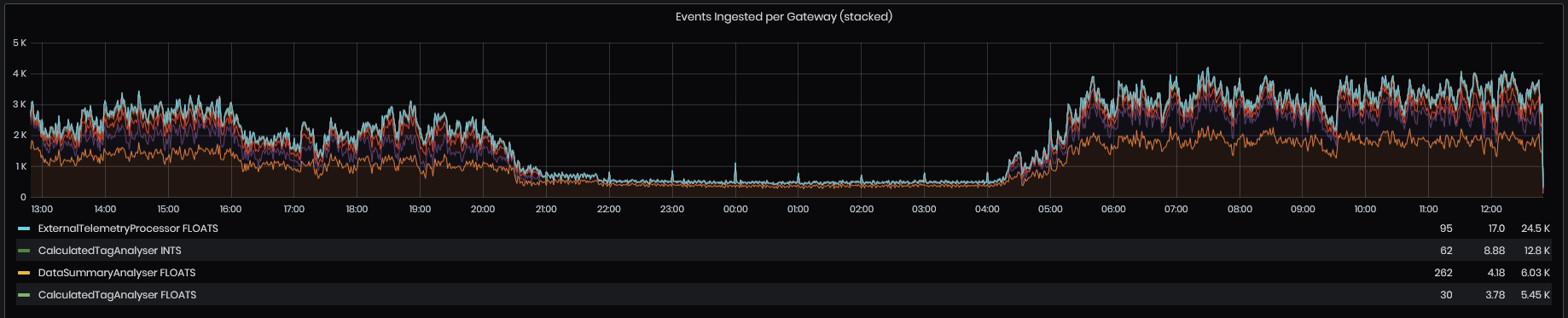
Figure 13: System Health - Telemetry - Events ingested per gateway
This chart shows:
- Telemetry sent - how many events are being sent by our devices
- Telemetry sent attempts – how many attempts to send an event have been made for a specific event by a device. This should always be the same as Telemetry Sent chart. If different, this indicates a problem that needs to be mitigated
- Total devices (Right Y-Axis) – the number of devices connected to IoT Hub
Linux MTConnect Data
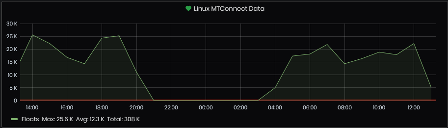
Figure 14: System Health - Telemetry -Linux MTConnect
Edge MT Connect for the selected time period.
Windows MTConnect Data
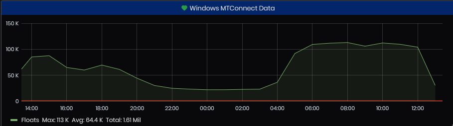
Figure 15: System Health - Telemetry - Windows MTConnect
LOG STATISTICS
This section shows the information on the system logs for the selected period in the dashboard (usually the last 24 hours).
It contains the following instruments:
- Errors and exceptions count per resource
- Warnings count per resource
- Errors and exceptions messages list per resource and time
- Warnings messages list per resource and time
Errors and Warnings
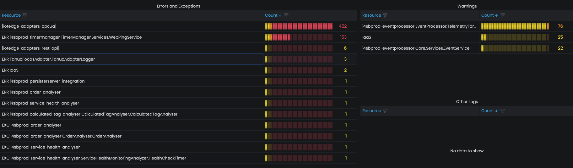
Figure 16: System Health - Log Statistics - Error and Exceptions
This graphic shows the number of errors and warnings across system components for the chosen period. The count of errors and warnings is visualized with table colored depending on the threshold - green, yellow, orange and red. If the count of errors is in the red range they should be mitigated.
Errors and Exceptions List
The errors and exceptions list is a table showing the errors and exceptions for the chosen period. The timestamp when the error or exception occurred, resource that generated the message and the message text.
Warnings List
The warnings list is a table showing the warnings for the chosen period. The timestamp when the warning occurred, resource that generated the message and the message text.
REQUESTS & DEPENDENCIES
This section shows information about requests made from, to and between different system components. A dependency is an external component that is called by a specific component. It's typically a service called using HTTP, or a database, or a file system.
The section contains the following instruments
- Requests duration
- Requests failed
- Dependencies duration by type
- Dependencies duration by target
Requests Duration
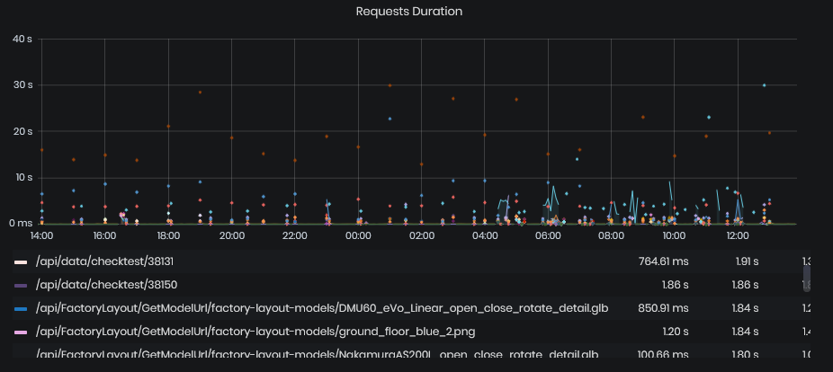
Figure 17: System Health - Requests & Dependencies -Request duration
This chart shows the duration of requests to specific URL for the chosen period. These statistics usually represent the duration of responses of parts of our internal/integrational APIs, or other similar HTTP endpoints.
The chart is provided with a summary table for each shown metric where we can find the minimum, maximum and average value of each series shown on the chart.
Requests Failed
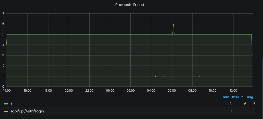
Figure 18: System Health - Requests & Dependencies - Requests failed
This chart shows the number of failed requests to specific URL for the chosen period. These statistics usually represent the count of failed responses at specific moment on parts of our internal/integrational APIs, or other similar HTTP endpoints. The chart is provided with a summary table for each shown metric where we can find the minimum, maximum and average value of each series shown on the chart.
Dependencies Duration by Target
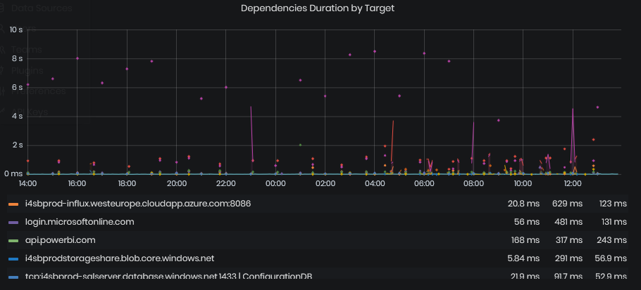
Figure 19: System Health - Requests & Dependencies - Requests duration by target
It shows the duration of calls to dependent specific URL for the chosen period. The URLs are usually, but not always, external APIs not managed within our platform. These statistics usually represent the duration of responses of parts of those APIs, or other similar HTTP endpoints.
The chart data is grouped by the endpoint being called.
The chart is provided with a summary table for each shown metric where we can find the minimum, maximum and average value of each series shown on the chart.
Dependencies Duration by Type
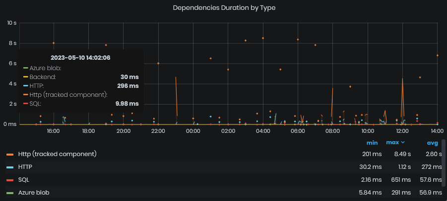
Figure 20: System Health - Requests & Dependencies - Requests duration by type
This chart is the same as the Dependencies Duration by Target. The difference is that endpoints are grouped by Type (HTTP, SQL, IoT Hub, and others).
The chart is provided with a summary table for each shown metric where we can find the minimum, maximum and average value of each series shown on the chart.
PERFORMANCE
SQL Server Load (DTU)
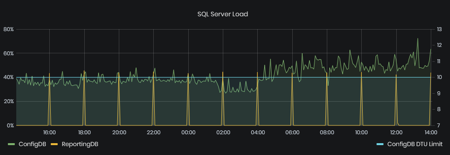
Figure 21: System Health - Performance - SQL Server load (DTU)
This graphic shows the load on the SQL server databases in number of DTU items used for the chosen period. DTU is Database Transactional Unit and is an Azure SQL specific metric on how much resources a database is using.
SQL Server Data Space Used
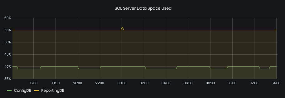
Figure 22: System Health - Performance - SQL Server data space used
This graphic shows the percentage of SQL Server Data Space used for ConfigDB and ReportingDB during the selected time period.
SQL Server Successful Connections
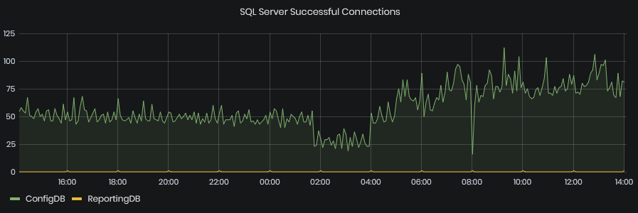
Figure 23: System Health - Performance - SQL Server Successful connections
This graphic shows the SQL Server Connections succeeded for the selected time interval.
SQL Server Failed Connections
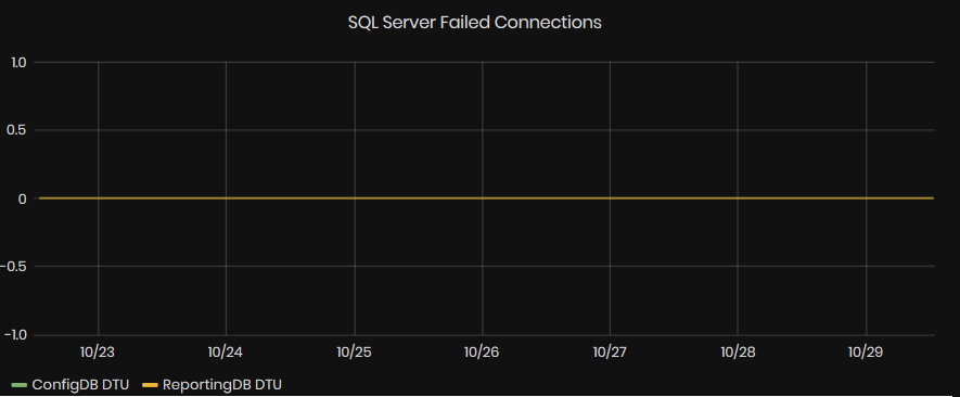
Figure 24: System Health - Performance - SQL Server Failed connections
This graphic shows the SQL Server Connections failed for the selected time interval.
Service Bug Queues
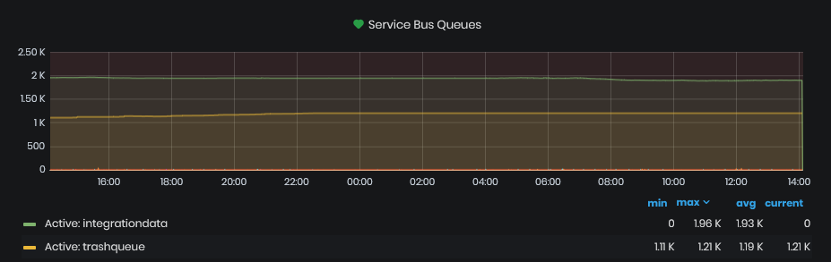
Figure 25: System Health - Performance - Service bug queues
This chart shows the number of messages in service bus queues across time for the chosen period in the dashboard.
Active queues are those that constantly consume messages. From them different system components are retrieving and processing those messages. If the number of messages raise too much this means that some component is processing them slowly. If the number raises constantly this means that some component is not running at all.
Dead-lettered queues correspond to the specific active queues and they contain messages for which the processing has failed a certain amount of times. These queues should always contain zero items. If there any messages here, then this is an indication of a problem and should be mitigated.
The chart is provided with a summary table for each shown metric where we can find the minimum, maximum, average and current number of messages within each queue for the chosen period.
VM Activity
All virtual machine metrics are evaluated and persisted once per minute.
This section shows the information on the performance and important event logs of the few virtual machines in the system for the selected period in the dashboard.
CPU Usage
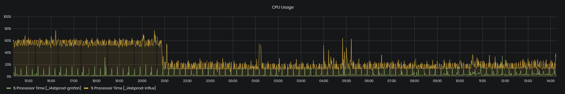
Figure 26: System Health - VM Activity - CPU usage
The charts show the usage of CPU by two virtual machines – Influx DB Server VM and Grafana VM.
- CPU usage is measured in percentage on the left Y-Axis
Memory Usage
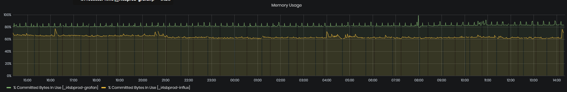
Figure 27: System Health - VM Activity - Memory usage
The charts show the usage of memory by two virtual machines – Influx DB Server VM and Grafana VM.
- Memory usage is measured in GB on the right Y-Axis
Influx Application Logs
This table contains Influx application messages logs by timestamp.
There are listed the most important event log entries from the Event Log of the Time series DB Server virtual machine for the chosen period in the dashboard. Each message should be carefully reviewed and all identified problems should be mitigated.
Grafana Application Logs
This table contains Grafana application messages logs by timestamp.
There are listed the most important event log entries from the Event Log of the Visualization virtual machine for the chosen period in the dashboard. If some counts are too big, they should be reviewed and if a problem is found it should be mitigated.
SYSTEM INFORMATION
Certificates Status
A table with certification statuses of Upkip resources in Azure is displayed. The table shows for each resource Type, Resource, Description, ExpiresOn, DaysToExpiration, and Timestamp.
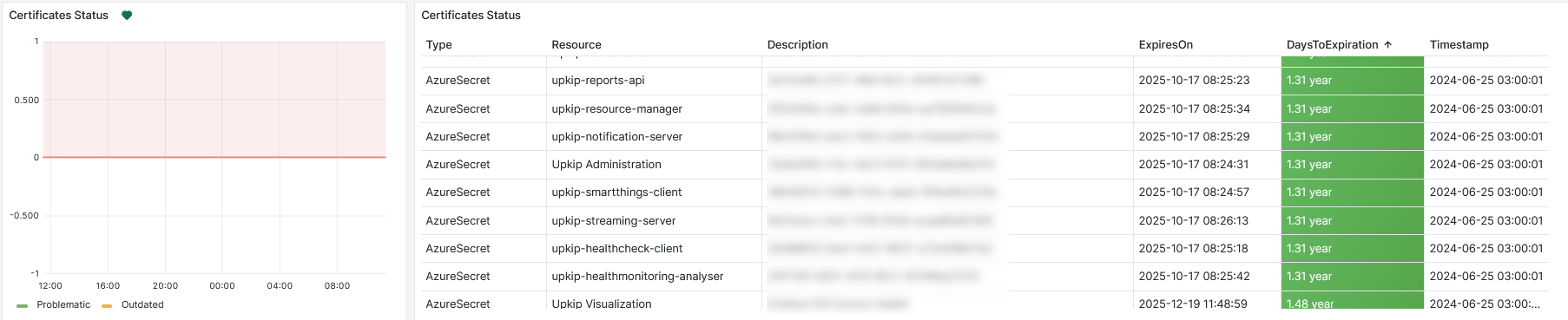
Figure 28: System Information - Certificates status
License Statuses
A license status table of all organizations in Upkip is displayed. ExpiresOn, DaysToExpiration is disploayed for each organization. If the license has already expired, DaysToExpiration is colored red.

Figure 29: System Information - Licenses status
Influx and Grafana Backups
Date and time of Influx and Grafana backups are displayed.
Upkip Grafana database backup is done in 24 hours. Upkip Influx database backup is done every 8 hours.
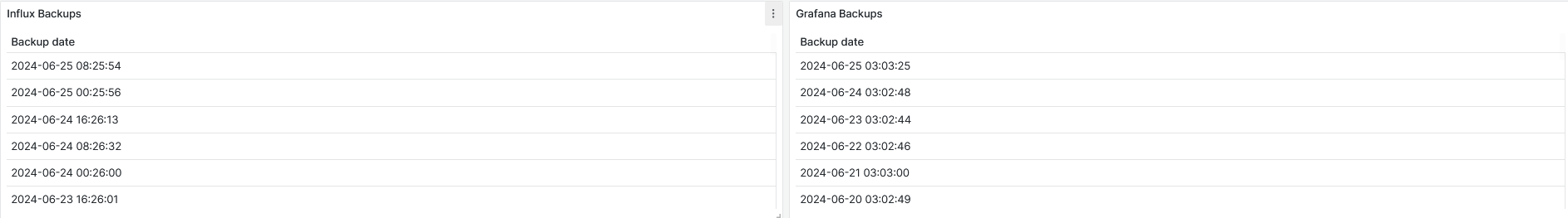
Figure 30: System Information - Influx and Grafana backups
Upkip Components
A table of Upkip components is shown with Group, Name, Version, Reported Time and Version Date.
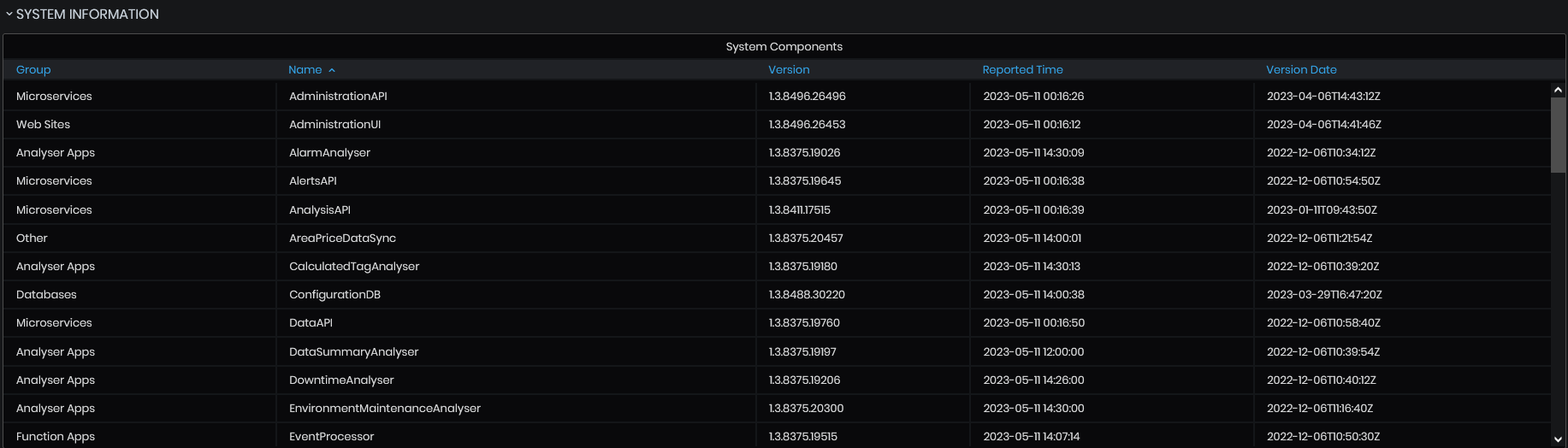
Figure 31: System Information - System Information
Influx DB Metrics
Precondition: The System menu is opened.
Click the InfluxDB Metrics menu button.
- The InfluxDB metrics dashboard opens.
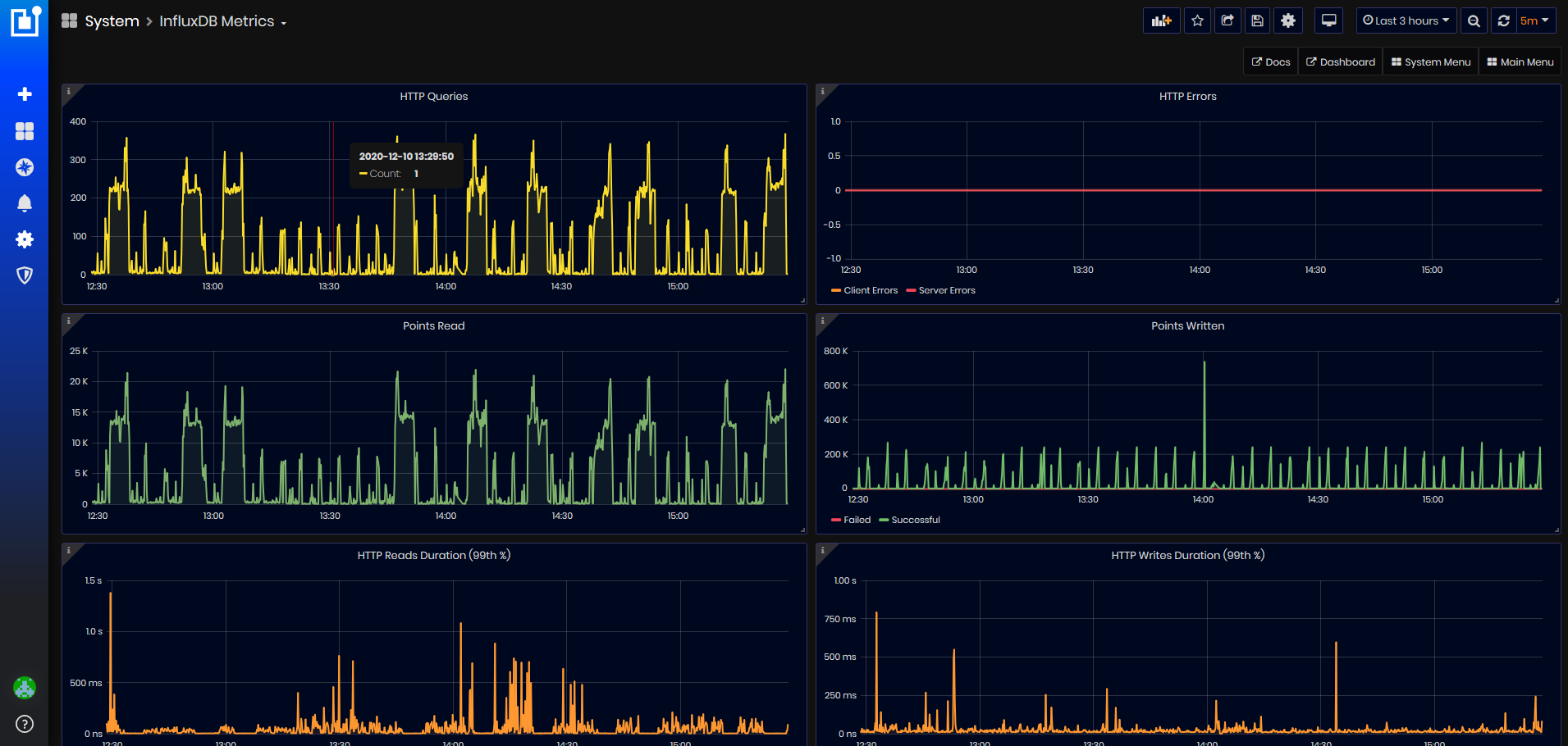
Figure 32: InfluxDB Metrics dashboard
HTTP Queries
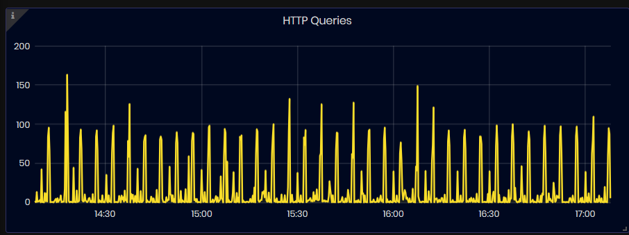
Figure 33: InfluxDB Metrics - HTTP Queries
This graphic shows the number of queries executed for the selected time interval.
HTTP Errors
Figure 34: InfluxDB Metrics - HTTP Errors
The graphic shows the number of failed queries for the selected time interval. The errors are split in two types: server and client errors.
-
Server Errors: shows the number of queries failed due to server errors
-
Client Errors: shows the number of queries failed due to client errors (4XX HTTP status code)
Points Read
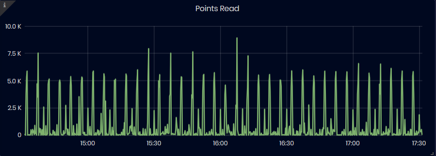
Figure 35: InfluxDB Metrics - Points Read
The chart shows the number of points read from the database during the selected time interval.
Points Written
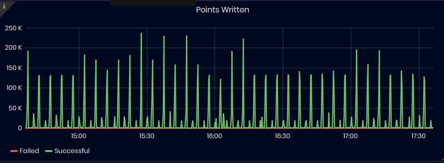
Figure 36: InfluxDB Metrics - Points Written
The chart shows the number of points written to the database over time. The data is split in two types: failed and successful writes. For a more focuses view, failed chart is negated and will be shown towards the negative end of the Y-axis
HTTP Reads Duration (99th %)
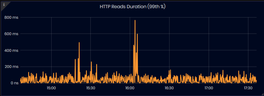
Figure 37: InfluxDB Metrics - HTTP Reads duration (99th %)
The chart shows the duration, in nanoseconds, of the slowest 1% of all read queries for the selected time interval.
HTTP Writes Duration (99th %)
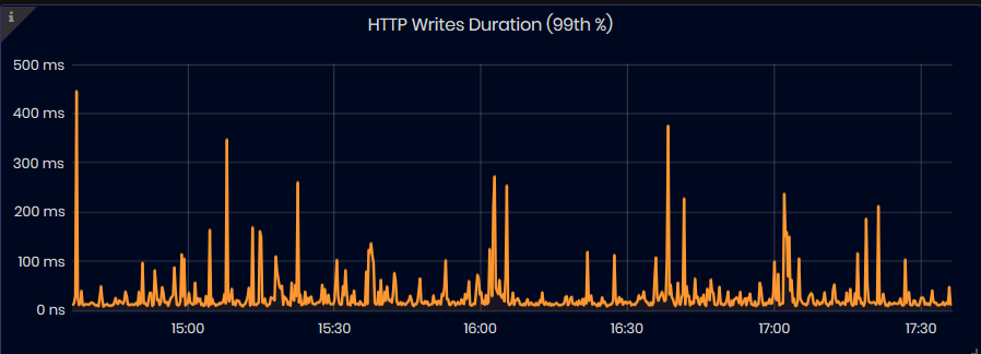
Figure 38: InfluxDB Metrics - HTTP Writen Duration (99th %)
The chart shows the duration, in nanoseconds, of the slowest 1% of all write queries for the selected time interval.
Number of Series
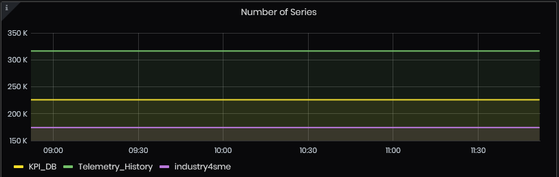
Figure 39: InfluxDB Metrics - Number of series
The chart shows the number of series per database for the selected time interval.
Runtime
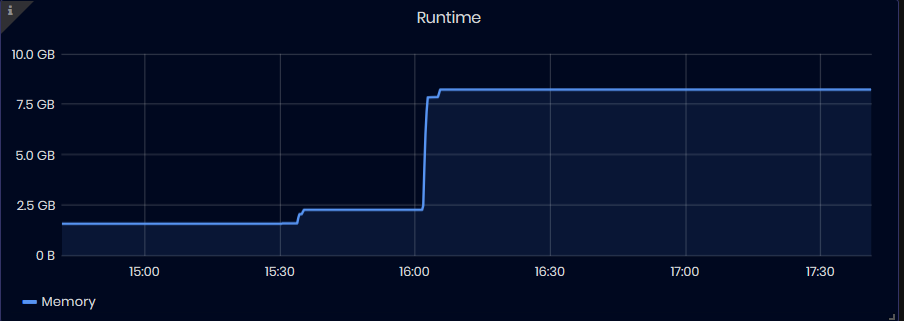
Figure 40: InfluxDB Metrics - Runtime
The chart shows the following runtime statistics over time:
- Memory: shows the total number of bytes obtained from the OS for all internal data structures
Health Check
Precondition: The System menu is opened.
Click the Healath Check menu button.
- The Health Check dashboard opens.
Purpose: Health Check dashboard shows in a table status of execution of HealthCheckAPI requests which are executed every hour. Requests check some basic functions of the Notification server and Persister server.
- Notification Server test – send new telemetry, creates a new event, notification and warning. Notification email has been sent.
- Persister Server test – creates heartbeat, telemetry, and integration data (context details, work order and related details).
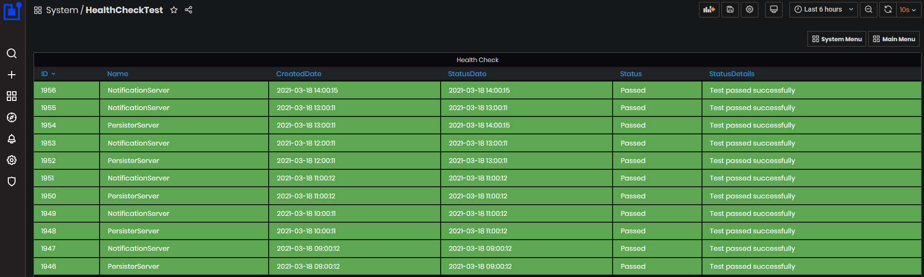
Figure 41: System - Health Check dashboard
Statuses from the tests can be:
- Passed – the test passed all of the checks.
- Failed – the test didn’t pass any of the checks.
- Partial - the test passed only some of the checks.
Heartbeat History
Precondition: The System menu is opened.
Click the Heartbeat history menu button.
- The Heartbeat history dashboard is opened
Purpose: On this dashboard, user administrator can search for missing heartbeats(2 or 3) for the selected time period. The returned result is grouped by adapters. Each machine heartbeat comes on each minute.
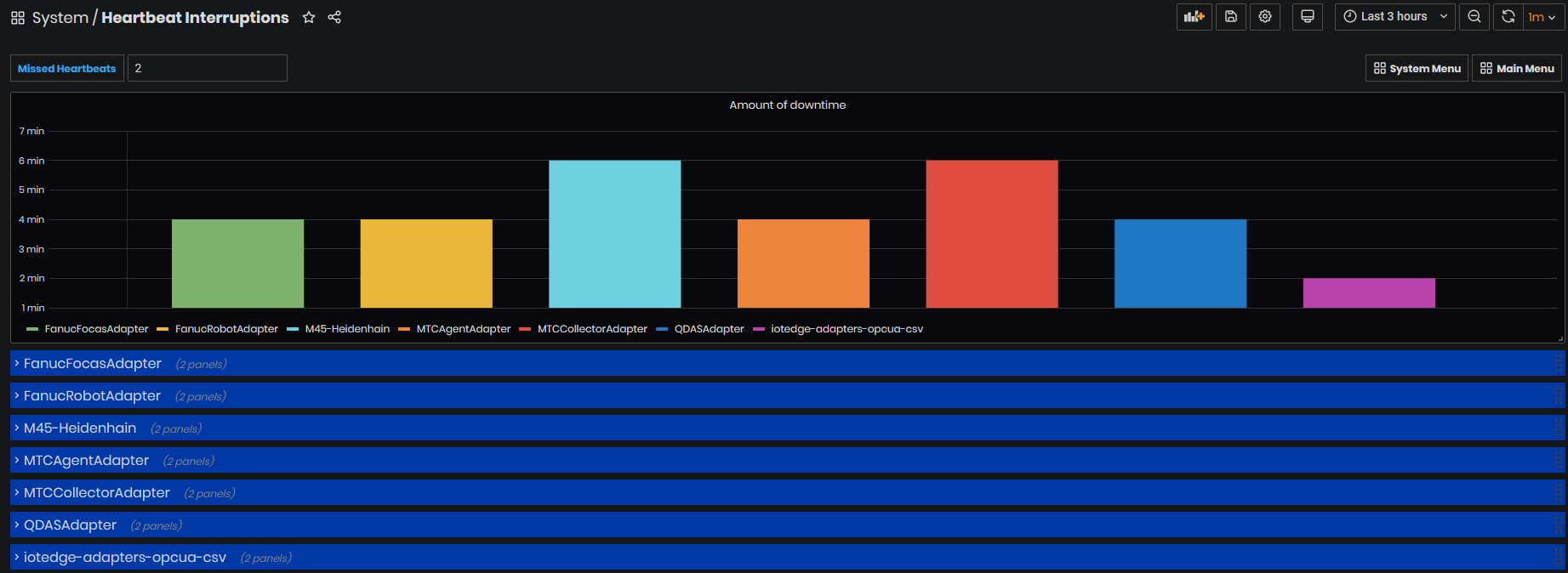
Figure 42: System - Heartbeat history dashboard
The first chart shows for each adapter the amount of downtime for which adapter has interruptions. For example, FanucRobotAdapter has interruptions of 4 min for the last 3 hours (selected by time interval from upper right).
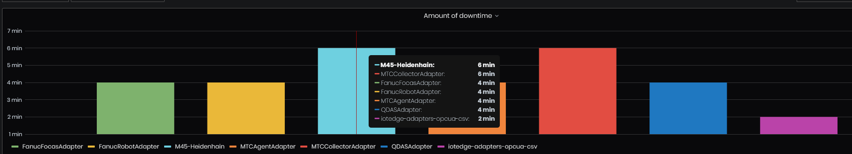
Figure 43: Heartbeat history - Chart Amount of downtime by adapter
For each adapter are shown in the table times when it has interruptions and affected machines:
Times when Heartbeat Stopped, Time delta of interruption, Heartbeat Restored, and list of affected machines.
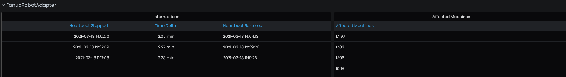
Figure 44: Heartbeat history - FanucRobotAdapter with interruptions and list of affected machines
Telemetry Analysis
Click on the Operator menu button. Click the Telemetry Analysis menu button.
- The Telemetry Analysis dashboard opens.
Purpose: The dashboard displays statistics on tag valudesfor the selected time period.
Statistics are displayed after selecting a machine from machine list and a tag from Display name.
The top shows Tag description by ID, Name, Display name, and Value type.
Tag Analysis is grouped in two panels: Simple and Advanced.
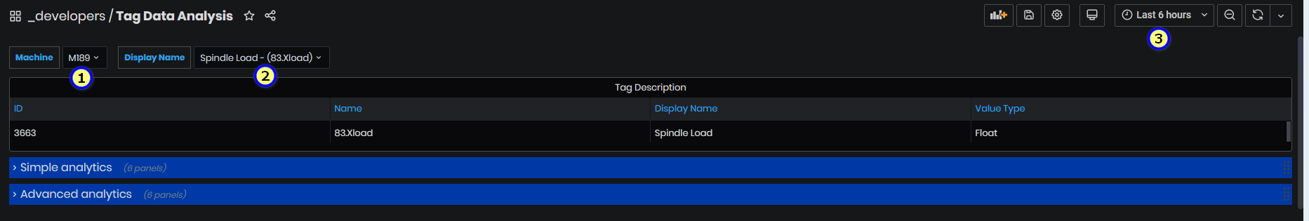
Figure 45: Telemetry analysis - selected a tag for machine
Symple analysis
Expand the Simple analysis panel.
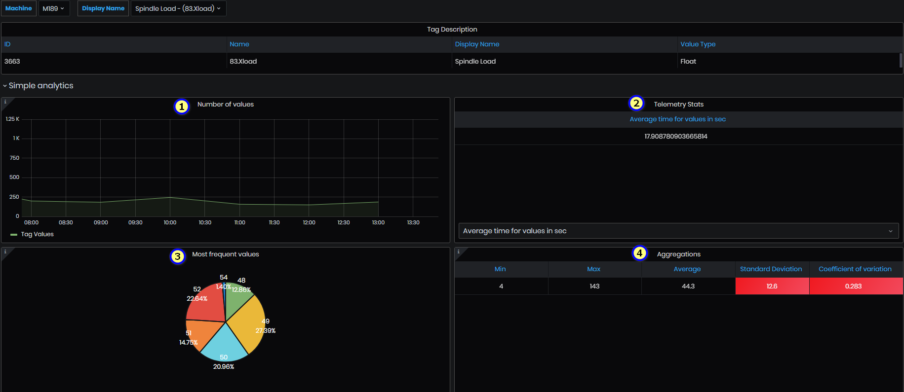
Figure 46: Value Analysis - Simple analysis-1
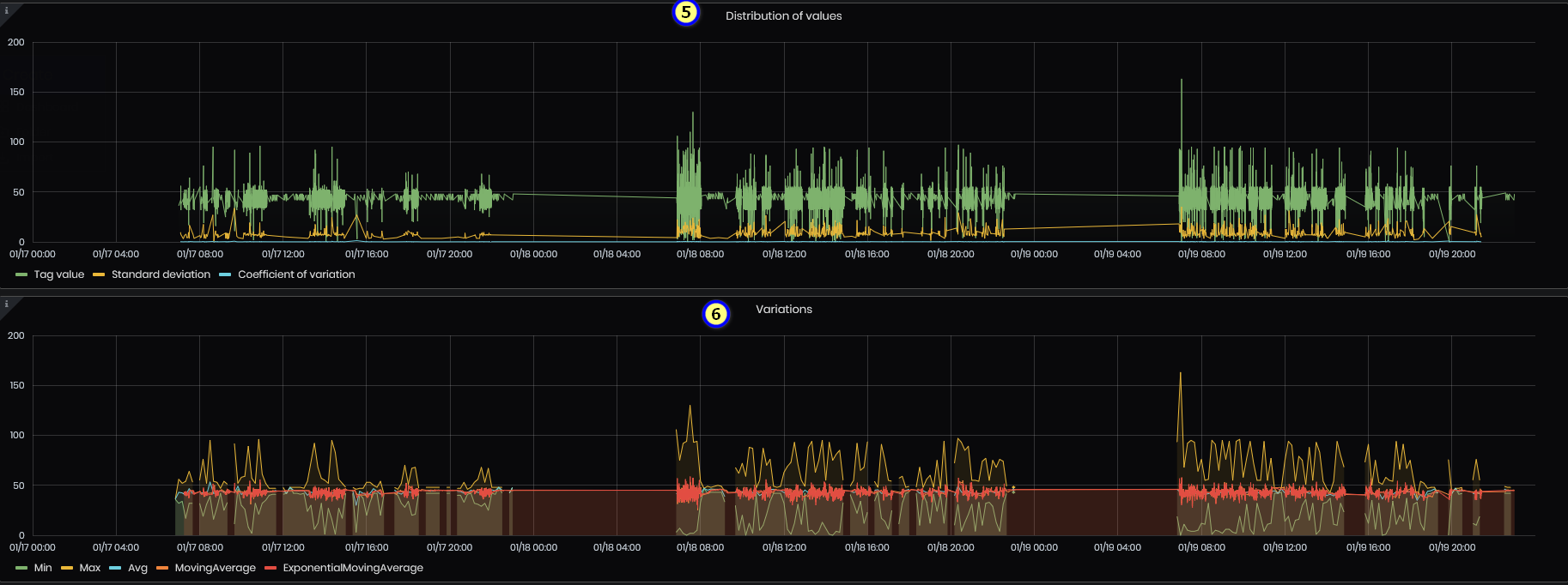
Figure 47: Value Analysis - Simple analysis- 2
- Number of values – the panel shows the number of values grouped by 1h for a given period.
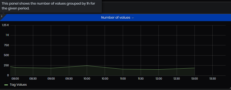
Figure 48: Simple value analysis - Number of values
- Telemetry Stats– in the panel lists, changing from the drop-down menu: Average time for values in sec, Elapsed time, Count all values, and Count distinct for the selected time period.
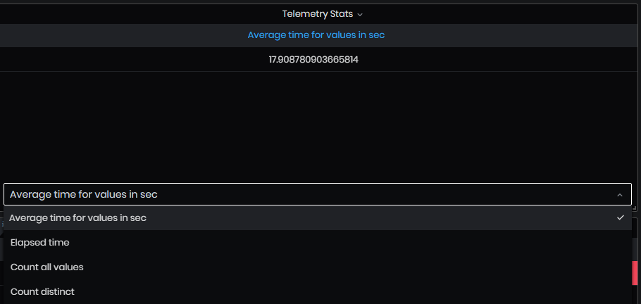
Figure 49: Simple value analysis - Telemetry stats
- Aggregations – This panel displays the aggregations (Min, Max, Mean, Standard deviation, Coefficient of variation).
Coefficient of variation = Standard deviation/Average
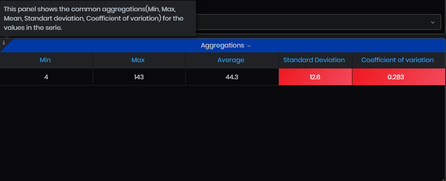
Figure 50: Simple value analysis - Aggregations
- Distribution of values – this panel shows all values for the given Tag and period. Standard deviation and coefficient of variation for the tag values.
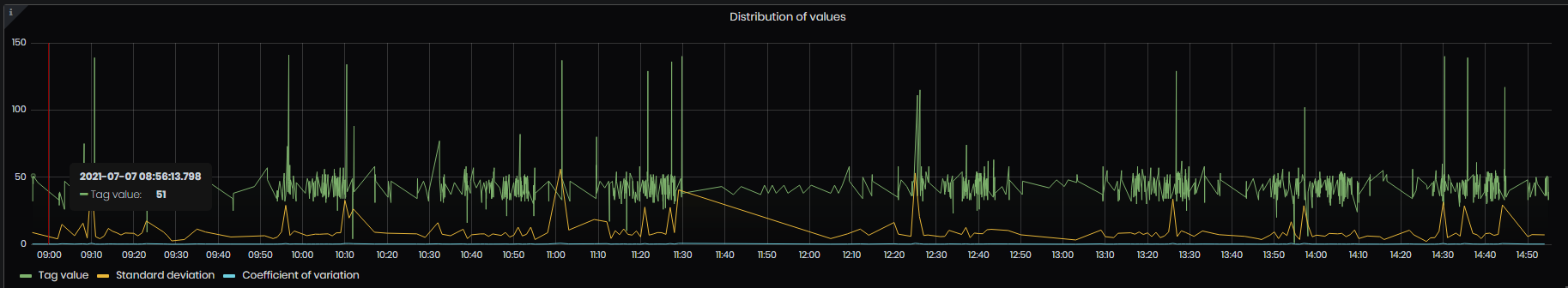
Figure 51: Simple value analysis - Distributions of values
- Variations – the panel shows the common variations for a given series of values(Min, Max, Average, Moving Average, and Exponential moving average).
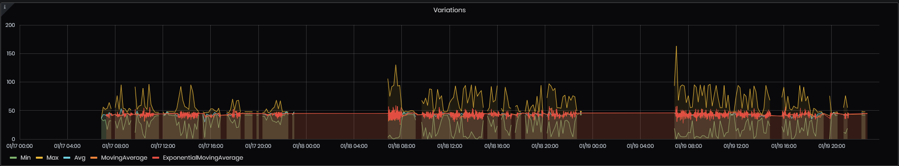
Figure 52: Simple value analysis – Variations
Advanced analysis
Expand the Advanced analysis panel.
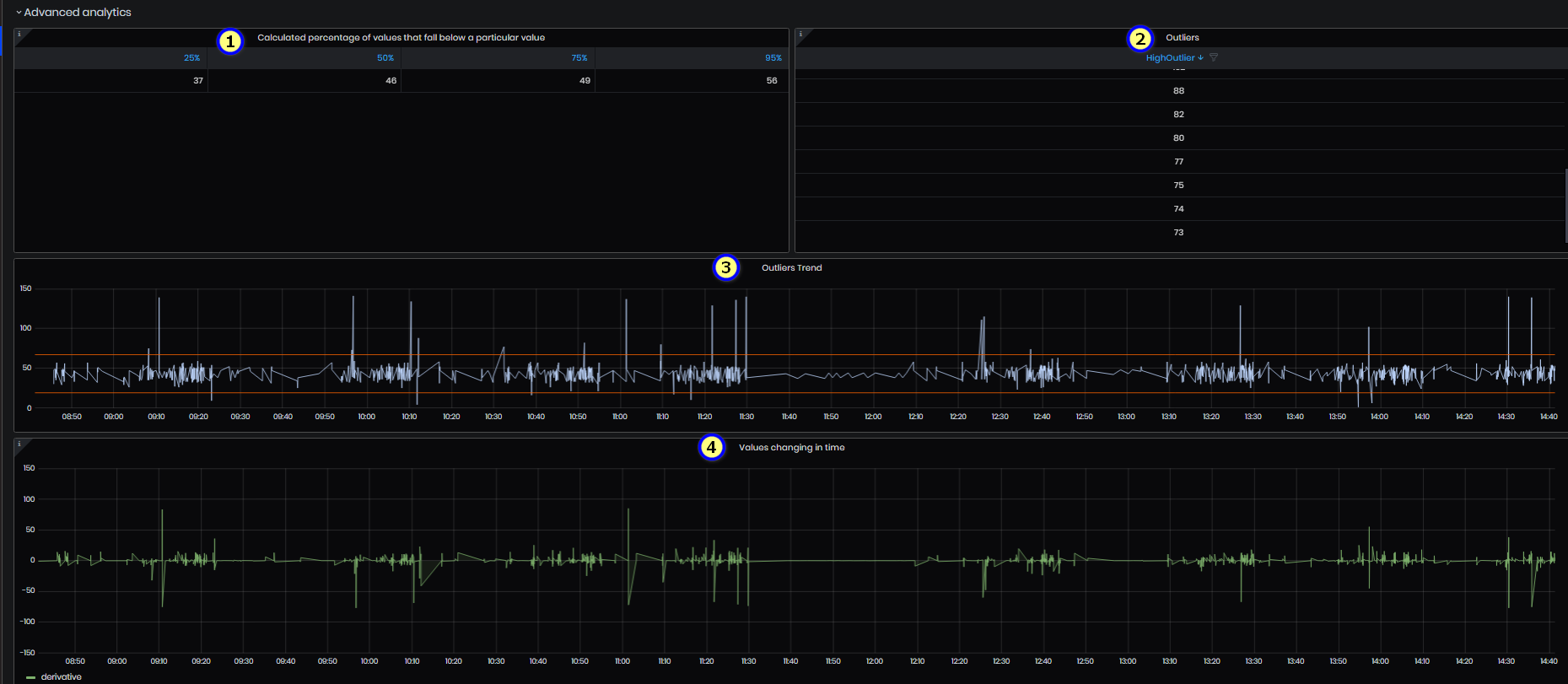
Figure 53: Advanced analysis -1
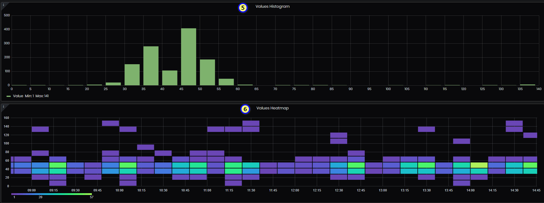
Figure 54: Advanced analysis -2
- Calculated percentage of values that fall below a particular value – the panel calculates the specific value from the series for every percentile/quantile. This indicates that the value is X% bigger than the values below it.
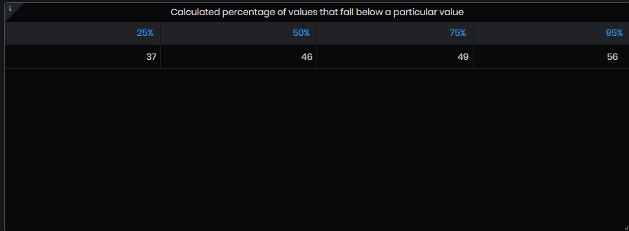
Figure 55: Advanced analysis - Calculated percentage of values that fall below a particular value
- Outliers – the panel shows values that are in abnormal distance from other values. Either extremely high or extremely low values.
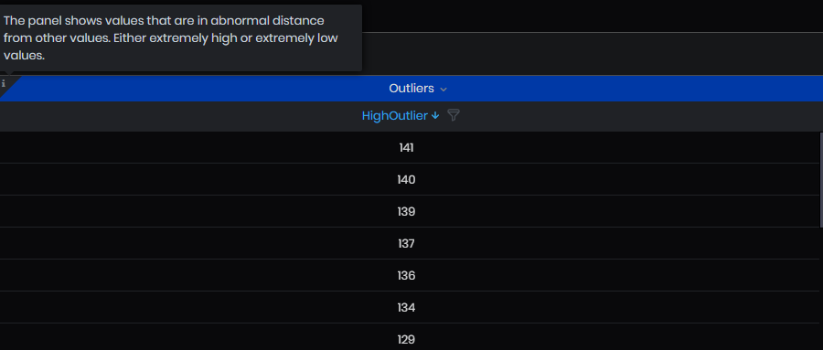
Figure 56: Advanced analysis - Outliers
- Outlier trend – outlier trend for the selected period. The chart shows tag values and lines with high and low outlier values.
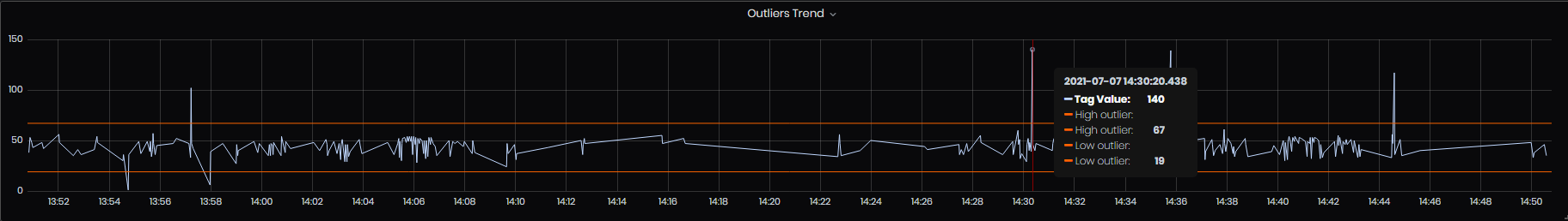
Figure 57: Advanced analysis - Outliers trend
- Values changing in time – the panel shows the change (how the value changed according to the value before it) between the values for the given Tag and period.
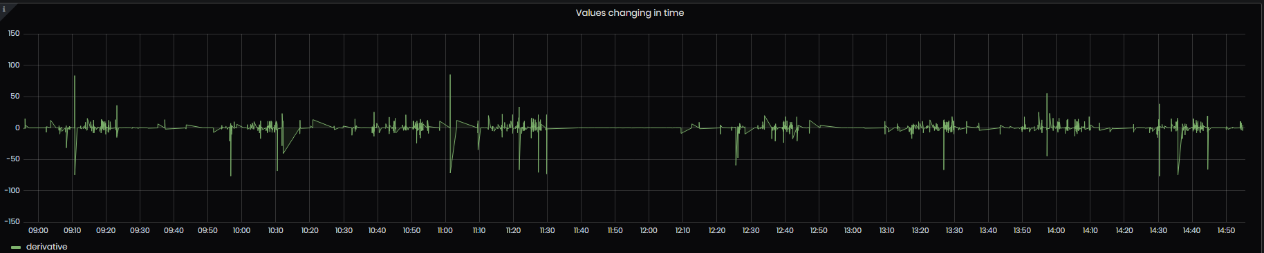
Figure 58: Advanced analysis - values changing in time
- Values Histogram - The histogram panel is a graphical representation of the distribution of numerical data - values related to specified tag. It groups values into buckets (sometimes also called bins) and then counts how many values fall into each bucket. Min and Max values for the selected period are shown also.
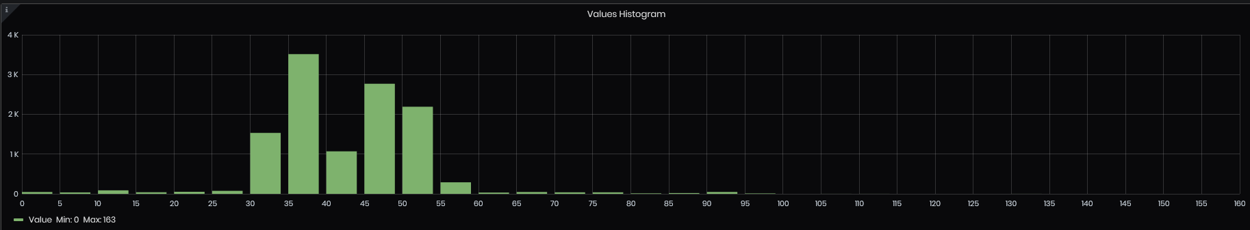
Figure 59: Advanced analysis - Values histogram
- Values Heatmap - The heatmap panel is a graphical representation of the distribution of numerical data - values related to a specified tag. It groups values into buckets (sometimes also called bins) and then counts how many values fall into each bucket. The heatmap is like a histogram, but over time where each time slice represents its own histogram. Instead of using bar height as a representation of frequency, it uses cells and colors the cell proportional to the number of values in the bucket.
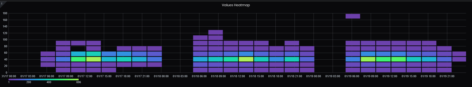
Figure 60: Advanced analysis - Values heatmap